Blog

  • What Is an IBAN Number? A US Guide to IBANs and SWIFT

    What Is an IBAN Number? A US Guide to IBANs and SWIFT

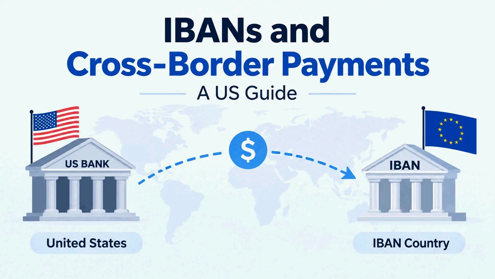
    Header: IBAN and US cross-border payment essentials

    An IBAN (International Bank Account Number) is a standardized code of up to 34 characters that identifies a specific bank account for cross-border payments. It combines a two-letter country code, two check digits, and a country-specific BBAN. US banks do not issue IBANs, so US senders and recipients use a routing number plus the bank’s SWIFT/BIC code instead.

    What Is an IBAN Number? Definition, Scope, and Limits

    An IBAN is an internationally agreed way to identify bank accounts across national borders. The goal is to reduce transcription errors and let banks in different countries process cross-border transactions using one consistent format, instead of a patchwork of national account-numbering schemes. An IBAN points to one customer’s account at a financial institution; it is not a generic bank address or a payment network.

    The standard behind it is ISO 13616. According to Wikipedia’s overview of the International Bank Account Number, the format was originally adopted by the European Committee for Banking Standards (ECBS) and has been published as the international standard ISO 13616 since 1997. The current version is ISO 13616:2020, which names SWIFT (the Society for Worldwide Interbank Financial Telecommunication) as the formal registrar.

    The 30-Second Definition

    An IBAN is a string of up to 34 alphanumeric characters made of three parts: a two-letter country code, two check digits, and a country-specific Basic Bank Account Number (BBAN) that holds the domestic bank code, branch identifier, and account number. Banks validate the check digits before releasing a payment, which catches most single-character typos at the point of data entry. In practice, an IBAN answers one question: which exact account, at which bank, in which country.

    What an IBAN Is Not

    An IBAN is not a bank identifier. A bank identifier — the SWIFT/BIC code — points to an institution or branch, while an IBAN points to a specific account inside that institution. International wires commonly require both.

    An IBAN is also not a payment network. SWIFT, SEPA, ACH, Fedwire, and card networks move or message money; an IBAN is only an addressing standard that those systems read.

    Finally, an IBAN is not a US routing number. A routing number is a nine-digit domestic code, and it is not accepted as an IBAN substitute in any IBAN country. As Ramp’s guide to IBAN numbers puts it, if a form asks you for a US IBAN, there simply isn’t one to provide.

    The practical boundary for US readers is simple: US banks do not issue IBANs, which is why the rest of this guide focuses on what US senders and recipients actually put on a payment form.

    Do US Banks Issue IBANs? What to Use Instead

    No. US banks do not issue IBANs, and US accounts are not assigned one when opened. The United States relies on ABA routing transit numbers for domestic account identification, and on SWIFT codes for international routing. Any adoption of the IBAN standard by US banks would likely be initiated by ANSI ASC X9, the US financial services standards development organization — a working group (X9B20) was established as an X9 subcommittee to generate an IBAN construction for US bank accounts, but nothing has replaced routing numbers in practice.

    The US substitute is a three-part package: a nine-digit ABA routing number, the account number, and the bank’s SWIFT/BIC code whenever the payment crosses a border.

    Domestic rails explain why the US never needed IBANs. ACH, Fedwire, FedNow, and RTP all operate inside a single national numbering system, so nine-digit routing numbers plus account numbers are sufficient for the vast majority of US payments. SEPA Instant plays an equivalent same-country role in the euro area, but it sits on top of IBAN-based accounts.

    What to Put on an International Payment Form as a US Sender

    When a US bank’s wire form asks for beneficiary details, use the recipient’s local fields, not US ones. The typical field-by-field entries look like this:

    • Beneficiary IBAN or account number: enter the full IBAN for the recipient’s country, exactly as provided, with no spaces and no edits to the check digits.
    • Beneficiary bank SWIFT/BIC: the 8- or 11-character code identifying the recipient’s bank.
    • Beneficiary name and address: exactly as the account is registered.
    • Your routing number and account number: these identify your own US account as the source of funds, not the recipient.
    • Intermediary bank details: requested when your bank has no direct relationship with the recipient’s bank.

    If a form asks for a “US IBAN” on your side, there is nothing to enter; your routing number and account number serve that role.

    What to Give a Foreign Payer as a US Recipient

    A foreign payer sending money into a US account needs four details: your bank’s nine-digit ABA routing number, your account number, your bank’s SWIFT/BIC code, and the account holder name as registered.

    Multi-currency providers such as Wise and Revolut can assign IBANs to eligible accounts precisely so international payers have a single validated identifier to use. If you hold an account with one of those providers and it has been issued an IBAN, share that IBAN instead of domestic details. If you bank with a traditional US institution, share the routing number, account number, and SWIFT/BIC combination.

    One timing detail matters on the receiving end: funds arriving in a foreign currency are converted at the prevailing exchange rate before they reach your account, so the number on the invoice is not necessarily the number that lands.

    How an IBAN Is Structured: Country Code, Check Digits, and BBAN

    Every IBAN follows the same three-part sequence, and every part has a fixed job.

    The country code occupies the first two characters and uses ISO 3166-1 alpha-2 — DE for Germany, FR for France, GB for the United Kingdom. The country code determines which BBAN format applies, so it is the first thing a validating system checks.

    The check digits occupy positions three and four. They are calculated from the rest of the string and validated with the MOD-97 checksum described in ISO 7064, letting a bank confirm the number contains no simple transcription error before submitting a transaction.

    The BBAN fills every remaining character, up to a maximum of 30 alphanumeric characters. It carries the domestic bank code, branch identifier, and account number in whatever national format the country uses. The national central bank or designated payment authority decides that format, which is why BBAN structures are not consistent between countries.
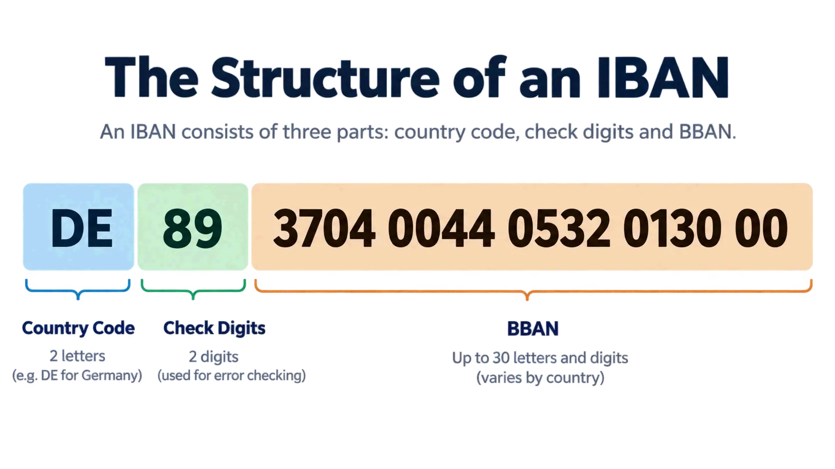
    IBAN three-part structure: country code, check digits, BBAN

    Real IBAN Examples by Country

    The following examples come from Ramp’s IBAN guide and are illustrative formats rather than live accounts:

    Country Country Code Total Length Sample Format
    Norway NO 15 NO93 8601 1117 947
    Belgium BE 16 BE68 5390 0754 7034
    Netherlands NL 18 NL91 ABNA 0417 1643 00
    Germany DE 22 DE89 3704 0044 0532 0130 00
    United Kingdom GB 22 GB29 NWBK 6016 1331 9268 19
    France FR 27 FR14 2004 1010 0505 0001 3M02 606
    Malta MT 31 MT84 MALT 0110 0012 3456 MTLC AST0 01S

    Reading the German example: DE is the country, 89 is the checksum, 37040044 is the bank identifier, and 0532013000 is the individual account number.

    Why IBAN Length Varies by Country

    Total IBAN length is fixed nationally, which is why it ranges from 15 characters in Norway to the 34-character ceiling. Norway uses 15, Belgium 16, the Netherlands 18, Germany and the UK 22, Spain 24, France and Italy 27, and Malta 31.

    Because each country’s BBAN encodes different elements — some include branch codes, some include national check digits, some include account-type indicators — the length cannot be standardized across borders. The IBAN registry is the official source for each country’s length and format, and validating systems check the total length against the country code before running the checksum.

    How IBAN Check Digits Work — and What They Don’t Verify

    The IBAN check digits use a MOD-97 operation, formally described in ISO 7064, to confirm that a string contains no simple errors. The validation is designed to catch single-character substitutions, nearly all single transpositions, and shifts of the whole string to the left or right.

    This matters because it moves error detection to the moment of data entry. A bank’s system can reject a mistyped IBAN immediately rather than discovering the problem days later when the payment bounces back through intermediary banks. That design goal — validating as much as possible at the point of entry — is the core reason IBANs reduced cross-border failure rates compared with the pre-1997 arrangement.

    A Worked MOD-97 Example

    The validation algorithm has four steps: confirm the total length matches the country, move the first four characters to the end, replace each letter with two digits (A = 10 through Z = 35), then divide the resulting integer by 97. If the remainder is 1, the check digit test passes.
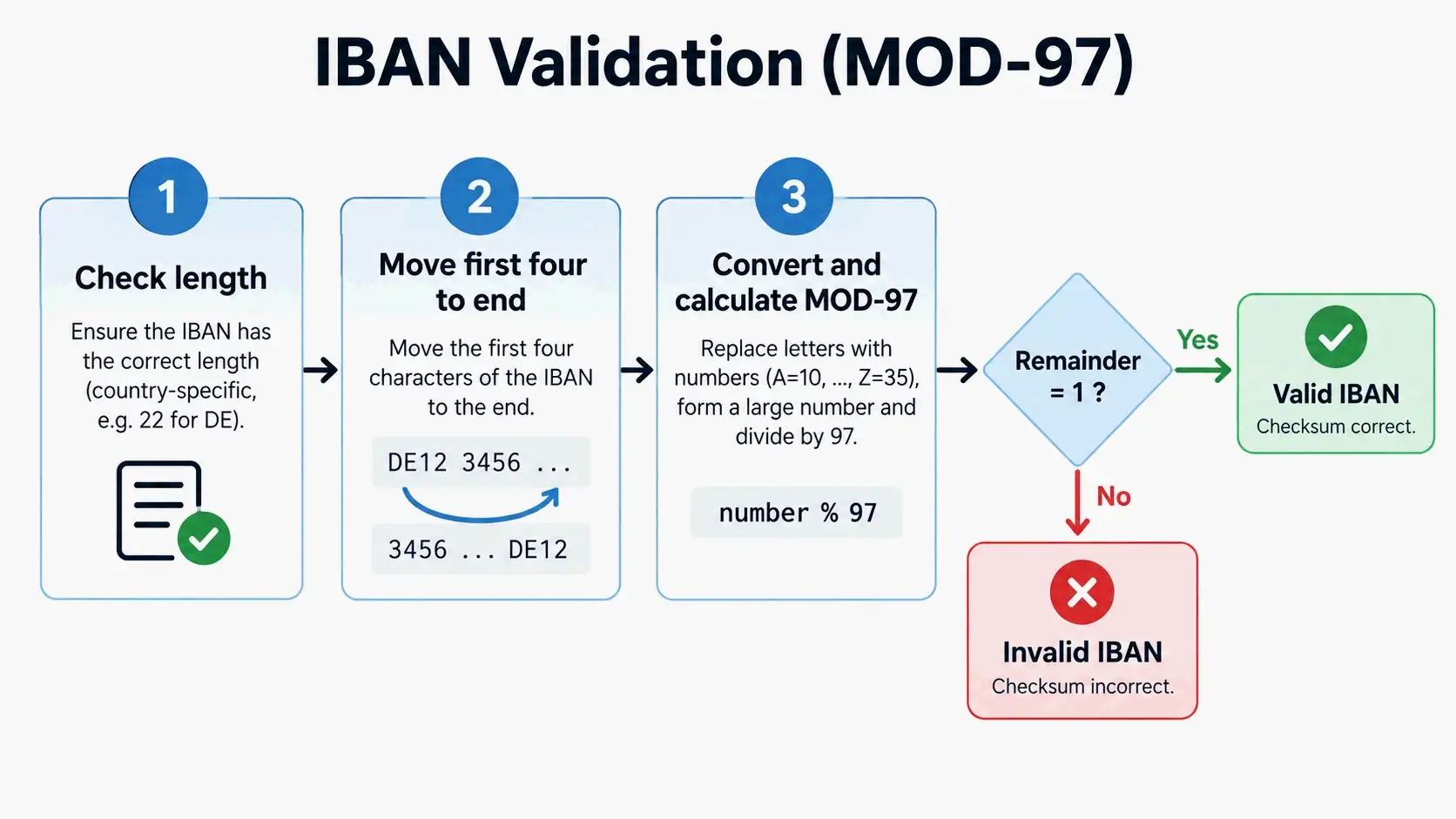
    Simplified MOD-97 validation steps

    Using the fictitious United Kingdom example published on Wikipedia, IBAN GB82 WEST 1234 5698 7654 32:

    1. Rearrange: move GB82 to the end → WEST12345698765432GB82
    2. Convert letters to digits: W=32, E=14, S=28, T=29, then G=16, B=11 → 3214282912345698765432161182
    3. Compute the remainder: 3214282912345698765432161182 mod 97 = 1

    Because the remainder is 1, the string passes the check digit test.

    What the Checksum Does Not Check

    This is the limitation that costs people money. A checksum-valid IBAN confirms the string is correctly formatted; it says nothing about who owns the account. A wrong IBAN that happens to be mathematically valid will send funds to the wrong recipient.

    As Bertrand Théaud, Founder of Statrys, notes: “A correctly formatted IBAN is not proof the payment will land in the right account. For transfers outside the SEPA zone, the check digits catch typos, not wrong account numbers, so validate the account holder’s name yourself, not just the string of characters.”

    Inside SEPA, banks are now required to flag a clear name mismatch before sending, though a close-enough match can still pass. Outside SEPA, banks generally do not verify that the recipient’s name matches the account holder before crediting funds, so recovery is slow and not guaranteed. The practical rule is to verify the account holder’s identity independently — by confirming the beneficiary name through a channel you trust — in addition to checking the IBAN string.

    IBAN vs SWIFT/BIC vs Routing Number: Which Code Does What?

    Each code answers a different question, and mixing them up is one of the most common causes of delayed international payments.

    Criteria IBAN SWIFT/BIC Routing Number
    Purpose Identifies an individual account Identifies a bank or branch Identifies a US financial institution
    Length Up to 34 characters 8–11 characters 9 digits
    Geographic use Primarily Europe, Middle East, Caribbean Worldwide United States, domestic only
    Format Country code + check digits + BBAN Bank code + country code + location code + optional branch code Numeric

    An IBAN identifies the account. A SWIFT/BIC code identifies the institution. A routing number identifies a US bank inside the domestic network and never travels beyond it. An IBAN and a SWIFT/BIC code are frequently used together on international wires: the SWIFT code routes the payment to the right bank, and the IBAN directs it to the right account inside that bank.
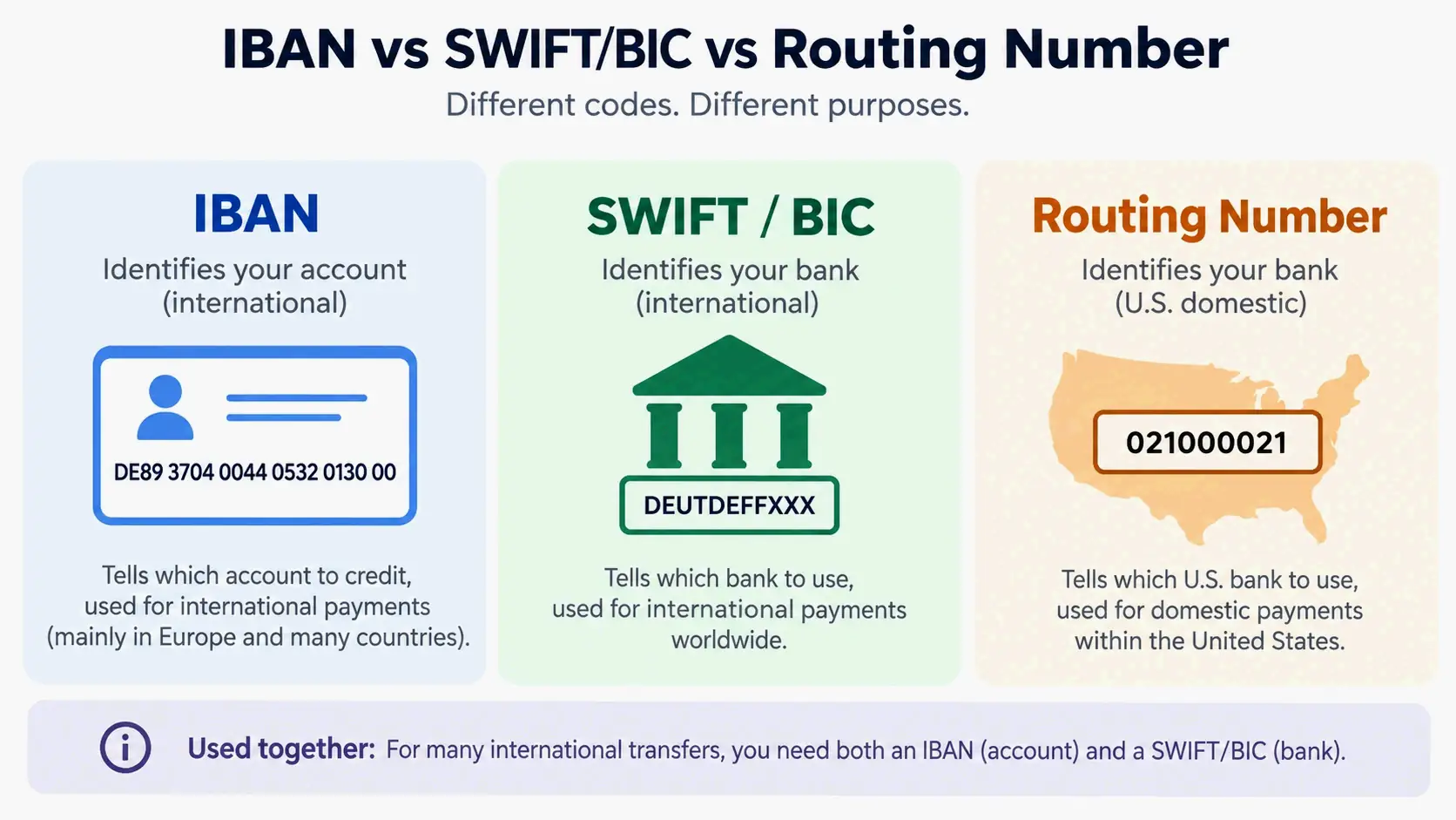
    Three codes, three roles: account vs bank vs US domestic

    The scale of the SWIFT network explains why SWIFT/BIC codes remain essential even when an IBAN is present. Ramp notes that SWIFT is used by more than 11,000 financial institutions worldwide, and that the network extends beyond traditional banks to brokerage firms, payment processors, and other participants.

    When You Need Both an IBAN and a SWIFT Code

    You need both when the destination account sits in an IBAN country. A transfer from France to Germany requires the recipient’s IBAN and the recipient bank’s SWIFT/BIC. Within SEPA, an IBAN alone is often sufficient to identify an account, and banks are no longer permitted to require customers to supply the beneficiary bank’s BIC for SEPA payments — but many payment forms still ask for both by default, and non-SEPA transfers generally do require both.

    When the destination account sits in a non-IBAN country, such as the US, you provide the SWIFT/BIC code plus the local account and routing details instead of an IBAN.

    Why the US Uses Routing Numbers Instead of IBANs

    The US financial system was built on domestic rails — ACH, Fedwire, FedNow, and RTP — that all identify institutions with nine-digit ABA routing numbers. Adding IBANs would mean adopting a second, parallel account-identification standard for accounts that already work inside a functioning national system.

    That arrangement creates friction in one direction only. US banks recognize the IBAN format and process incoming IBAN payments without issue, but they do not issue IBANs to their own customers. A US routing number, in turn, is not accepted as an IBAN substitute in Europe or anywhere else that uses the standard.

    Where IBANs Are Used — and Where They Aren’t

    IBAN adoption is usually described in two ways: how many countries use it, and which registry defines the format. Both numbers drift over time, which is why dated figures matter.

    According to Wikipedia, 89 countries were using the IBAN numbering system by December 2024. Per the IBAN Register maintained with data licensed from S.W.I.F.T. SCRL and updated 8 May 2026, around 90 countries and territories now use the IBAN format, spanning most of Europe, parts of the Middle East and North Africa, and a growing number of Sub-Saharan African and Central Asian states. Country counts move because new jurisdictions join the standard and register their BBAN formats over time.

    Adoption is heaviest in Europe, where the IBAN began inside the European Union. It is also established across the Middle East and the Caribbean, and present in parts of Africa.

    SEPA and the Eurozone

    SEPA — the Single Euro Payments Area — is the payment network and rulebook that made the IBAN the default account identifier for euro-denominated transfers. SEPA is not a code; it is a scheme in which the IBAN identifies the account and the payment is processed under SEPA rules and timelines.

    The transition was staged. The IBAN scheme fully replaced domestic numbering schemes from 31 December 2012, national systems for credit transfer and direct debit were abolished on 1 February 2014, and the requirement extended to all cross-border SEPA transactions on 1 February 2016. After those dates, the IBAN alone is sufficient to identify an account for home and foreign transactions in SEPA countries.

    Canada, Australia, and Other Non-IBAN Countries

    Canada and Australia do not use IBANs. Canadian financial institutions use routing numbers issued by Payments Canada for domestic transfers and SWIFT for international transfers, with no formal regulatory requirement to adopt IBAN. Australia uses Bank State Branch (BSB) codes for domestic transfers and SWIFT for international transfers — a BSB plus an account number combined is not an IBAN, even if a provider’s form labels it that way. New Zealand follows the same pattern. Most Asian countries, including Hong Kong and Singapore, rely on SWIFT/BIC codes and local account numbers rather than IBANs.

    Ukraine illustrates how a country can move onto the standard later. Ukrainian banks had used IBAN-format aliases on an ad hoc basis as a precursor to formal SWIFT registration, and that practice ended on 1 November 2019 when all Ukrainian banks fully switched to the IBAN standard.

    One compliance issue worth knowing about inside the euro area is IBAN discrimination: refusing or charging extra for a valid IBAN issued in another SEPA country. It is a rulebook violation rather than a technical limitation.

    How to Find Your IBAN (If You Have One)

    If you bank in an IBAN country, you do not apply for an IBAN separately — your bank assigns one automatically when you open the account, and it appears in a handful of predictable places.

    Five Places to Look

    1. Online banking: log in and open your account details or account summary page; most banks display the full IBAN alongside your account number and sort code.
    2. Paper or electronic statements: the IBAN typically appears near your account number and branch information.
    3. Mobile banking app: check sections labeled account details, international details, or payment details.
    4. Debit or credit card: some banks, particularly in Europe, print the IBAN on the card itself.
    5. Bank customer service: call or visit a branch; after verifying your identity, staff can provide the IBAN directly.

    US account holders will not find an IBAN in any of these places, because US banks do not issue them. If a form asks for your US IBAN, use your routing number, account number, and the bank’s SWIFT/BIC code instead.

    Using an IBAN Calculator Safely

    An IBAN calculator can reconstruct a full IBAN from your country code, bank code, and account number if your bank’s document doesn’t display the complete string. Treat third-party calculators cautiously: they are not your bank’s verified site, and entering sensitive account credentials into an unverified tool creates security risk. Prefer your bank’s own website or app, and never supply online banking login details to a calculator.

    What Happens If an IBAN Is Wrong or Missing

    The consequences depend on which kind of error you made. There are two distinct failure modes, and they are not equally serious.

    If the IBAN is incorrectly formatted — wrong length, wrong country code, or check digits that fail MOD-97 — the payment is rejected outright or stopped for manual correction. The system catches the error, but the money is still delayed.

    If the IBAN is correctly formatted but belongs to someone else, the checksum passes and the funds move. Outside SEPA, banks generally do not verify that the recipient’s name matches the account holder before crediting, so the payment reaches the wrong account and recovery depends on the cooperation of institutions that have no obligation to reverse it quickly.
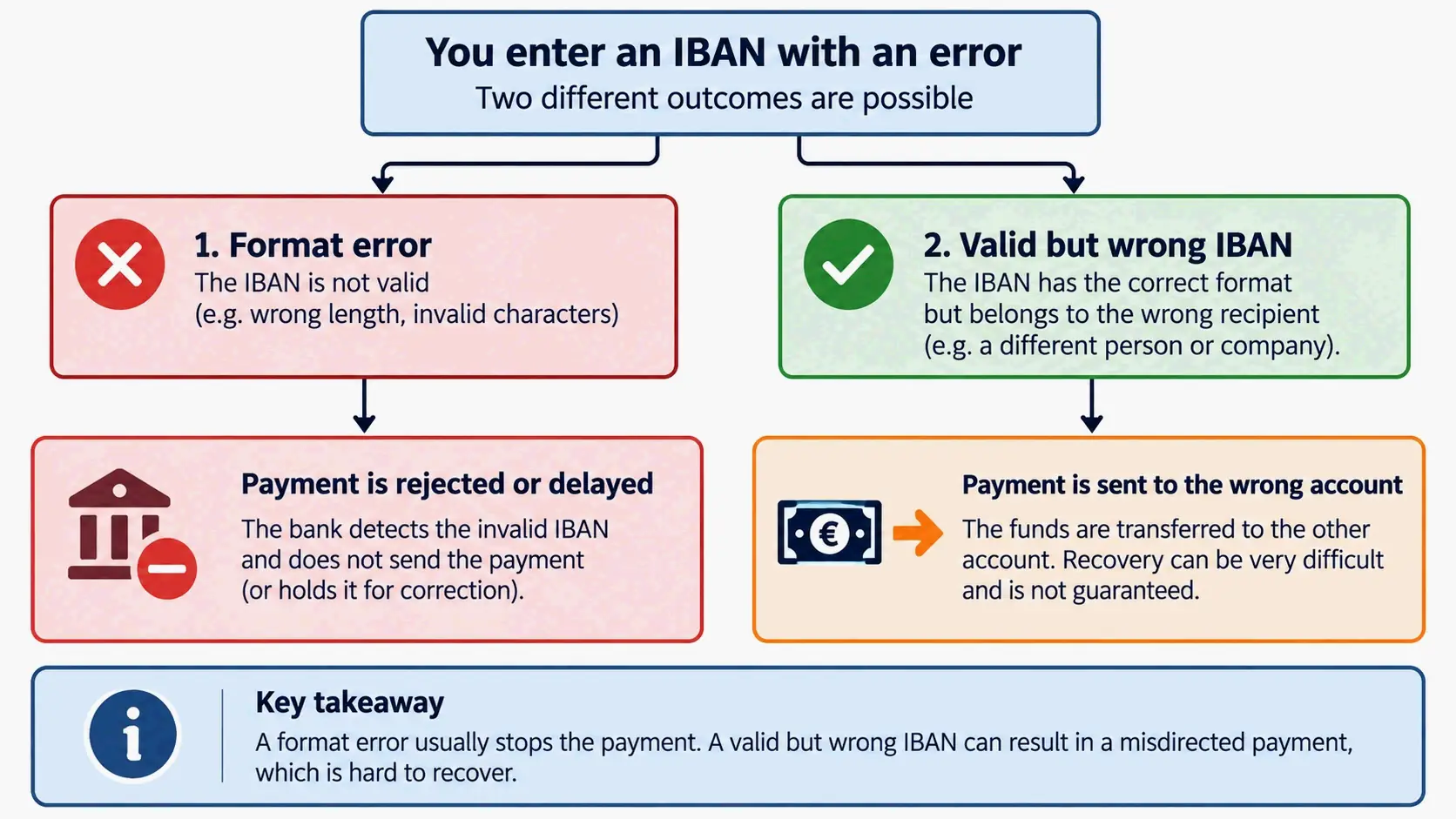
    Two IBAN error paths: format rejection vs wrong-account transfer

    What a Mistake Costs

    Per Statrys, sending a payment with the wrong format, or omitting the IBAN where it is required, routinely adds 3-5 business days and USD 15-40 in correction fees. That figure covers the administrative cost of retrieval and resubmission — it does not include what the payment’s delay costs your business relationship.

    International transfer costs also stack up independently of errors. Ramp walks through an illustrative USD 10,000 wire from the US to a German supplier: a USD 35 outgoing wire fee, a USD 20 intermediary bank fee, and an exchange rate 2% less favorable than the reference rate would add roughly USD 255 to the payment cost. The FX spread is typically the largest and least visible line item, which is why comparing the quoted exchange rate matters more than comparing flat wire fees.

    Cost Component What Drives It
    Outgoing wire fee Bank, account type, and transfer method
    Incoming wire fee Receiving bank and account type
    Intermediary bank fee Payment route and fee instructions
    FX spread Provider and currency pair
    Return or correction fee Applied when details are wrong or missing

    How to Recover a Misdirected Payment

    Contact your bank immediately. Speed is the single largest factor in whether funds can be recalled, because recovery depends on reaching the receiving bank before the money is withdrawn or moved onward.

    Ask your bank to issue a recall or return request to the beneficiary bank and to confirm in writing what was sent, when, and to which IBAN. Expect the process to be slow and not guaranteed outside SEPA. As Bertrand Théaud cautions, validate the account holder’s name yourself rather than relying on the string alone — that check is the only reliable protection, because by the time a misdirected payment is discovered, the funds have already landed.

    ISO 13616 and the IBAN Registry: Who Governs IBANs

    The IBAN standard is not maintained by any single bank or country. It is governed through ISO, with SWIFT acting as the registration authority that administers the country formats.

    From ECBS to ISO 13616

    The format was originally adopted by the European Committee for Banking Standards (ECBS), which produced a “slimmed down” version of the standard that permitted only upper-case letters and required a fixed IBAN length for each country. ISO published ISO 13616:1997, which was subsequently withdrawn and replaced by ISO 13616:2003. The standard was revised again in 2007 when it was split into two parts: ISO 13616-1, which specifies the IBAN elements, and ISO 13616-2, which describes the registration authority and the procedures for registering compliant country formats. The current version is ISO 13616:2020, which names SWIFT as the formal registrar.

    A useful historical marker of how involved country-level migration became: in Germany, the Deutsche Bundesbank and the German Banking Industry Committee required all holders of German bank codes to publish the specifics of their IBAN generation format, including legacy bank code handling, so third parties could generate IBANs independently. The first such catalogue was published in June 2013 as a variant of the old bank code file.

    How the Registry Keeps Country Formats Consistent

    The IBAN registry is the official catalogue of countries that follow the standard. It records each country’s IBAN structure, character types, and length requirements, along with an update history and definitions of the terms used in IBAN transactions — and it is the reference banks and payment processors check when validating IBANs or updating their systems. Because BBAN formats are set nationally, the registry is what keeps those national decisions legible to every other participating country.

    Ukraine’s full switchover to IBAN on 1 November 2019 is a more recent example of how countries move from informal IBAN-format aliases to formal participation in the standard.

    Conclusion

    An IBAN is an international bank account identifier used in around 90 countries and territories, but the United States does not issue them. US senders and recipients work with routing numbers, account numbers, and SWIFT/BIC codes instead — and any form asking for a US IBAN has no answer to give.

    Before sending an international payment, confirm the recipient’s name independently rather than trusting a valid-looking string, verify the IBAN format against the country’s registry or a trusted calculator, and keep the SWIFT/BIC code on file for the recipient’s bank. If you suspect an IBAN error, contact your bank immediately, because recovery gets harder with every hour the funds remain in the wrong account.

    FAQ

    Does the United States have IBAN numbers?

    No. US banks do not issue IBANs, and US accounts are not assigned one. Domestic payments use a nine-digit ABA routing number plus an account number, while international payments use the bank’s SWIFT/BIC code. If a payment form asks you for a US IBAN, there is none to provide.

    Is an IBAN the same as a SWIFT code?

    No. An IBAN identifies a specific bank account, while a SWIFT/BIC code identifies the bank or financial institution that holds it. International wires often require both: the SWIFT code routes the payment to the correct bank, and the IBAN directs it to the correct account inside that bank.

    Is an IBAN the same as a routing number?

    No. An IBAN is an international account identifier used in IBAN countries. A routing number is a nine-digit US code used mainly for domestic payments. A US routing number is not accepted as an IBAN substitute in Europe or other IBAN regions, so foreign payers will need your bank’s SWIFT/BIC code instead.

    What happens if I use the wrong IBAN?

    An incorrectly formatted IBAN is rejected or held for correction. A valid IBAN belonging to someone else is worse: the funds move. Wrong or missing IBAN details can add 3-5 business days and USD 15-40 in correction fees. Contact your bank immediately if funds are misdirected; recovery is slow and not guaranteed outside SEPA.

    How do I find my IBAN number?

    Check your online banking account details, paper or electronic statements, or your debit or credit card, or contact your bank. An IBAN calculator can reconstruct the string from your country code, bank code, and account number. US account holders will not find an IBAN, because US banks do not issue them.

    How many characters is an IBAN, and why does the length vary by country?

    An IBAN can be up to 34 characters: a two-letter country code, two check digits, and a BBAN of up to 30 characters. Length varies because each country’s central bank or payment authority sets its own BBAN format. Norway uses 15 characters, while many countries use 22 to 34.

    Do Canada and Australia use IBANs?

    No. Canada uses routing numbers issued by Payments Canada for domestic transfers, and Australia uses Bank State Branch (BSB) codes plus account numbers. Both rely on SWIFT for international transfers. A BSB and account number combined is not an IBAN, even when a payment form labels it that way.
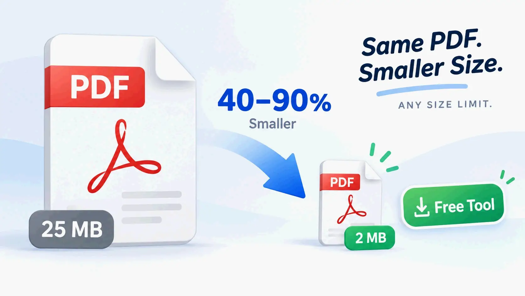
  • Free PDF Compress: Shrink Any PDF to Any Size Limit

    Free PDF Compress: Shrink Any PDF to Any Size Limit

    PDF compression simplified — any size, any limit

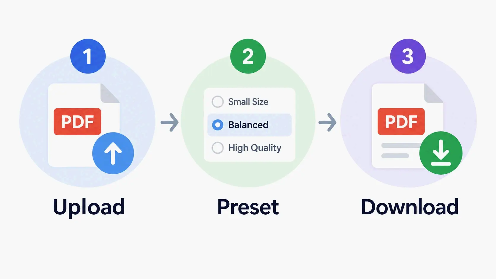
    Open a free PDF compress tool in your browser, upload your file, choose a preset—Low for print, Medium for email, High or Max for strict upload caps—and download it. No sign-up or watermark. Image-heavy PDFs usually shrink 40–90%; text-only files shrink much less.

    How to Free-Compress a PDF in Three Steps (No Sign-Up, No Watermark)

    Most free compressors do the whole job in three moves: upload, pick a level, download. But the tool you choose sets two important limits: the largest file it accepts and how many files it can handle at once. Check both before you start.

    Per PurePDF, the free tier processes two PDFs at a time without an account and five at a time with a free account. There’s no watermark and no daily cap (page last updated September 22, 2026). Input ceilings vary widely across tools: PDNob accepts up to 15 MB per file, PdfPixels up to 50 MB, and pdfFiller and OneClickPDF up to 100 MB.

    Steps 1–3: Upload, Choose a Preset, Download

    Step 1 — Open a free PDF compress tool in your browser. Most free tools don’t ask for an account or email. PurePDF states plainly that you can compress 2 PDFs at a time anonymously and 5 with a free account. There’s no watermark and no daily limit.

    Step 2 — Drop in your PDF. Check the tool’s own input ceiling first. Free online versions commonly cap a single file somewhere between 15 MB and 100 MB: PDNob allows 15 MB per file, PdfPixels 50 MB, and pdfFiller and OneClickPDF 100 MB each.

    Step 3 — Choose a preset, click compress, and download. I7 Pixel’s browser tool says a typical file usually finishes in under 30 seconds. For files under about 20 MB, the whole cycle normally takes under a minute.

    Three-step PDF compression flow: upload, choose preset, download

    Compressing several PDFs at once: batch runs and ZIP output

    Batch compression is the fastest way to clear out a folder before emailing or uploading. PurePDF returns several files as a ZIP, with each PDF compressed separately. pdfFiller markets batch processing as a differentiator for teams handling many documents.

    The practical limit is memory, not file count. Client-side tools use your device’s RAM and CPU, so a large batch of big scans can stall on a phone or an older laptop. If you’re compressing dozens of scanned packets, a desktop tool with real batch handling is more predictable.

    Which Compression Level Should You Choose: Low, Medium, High, or Max?

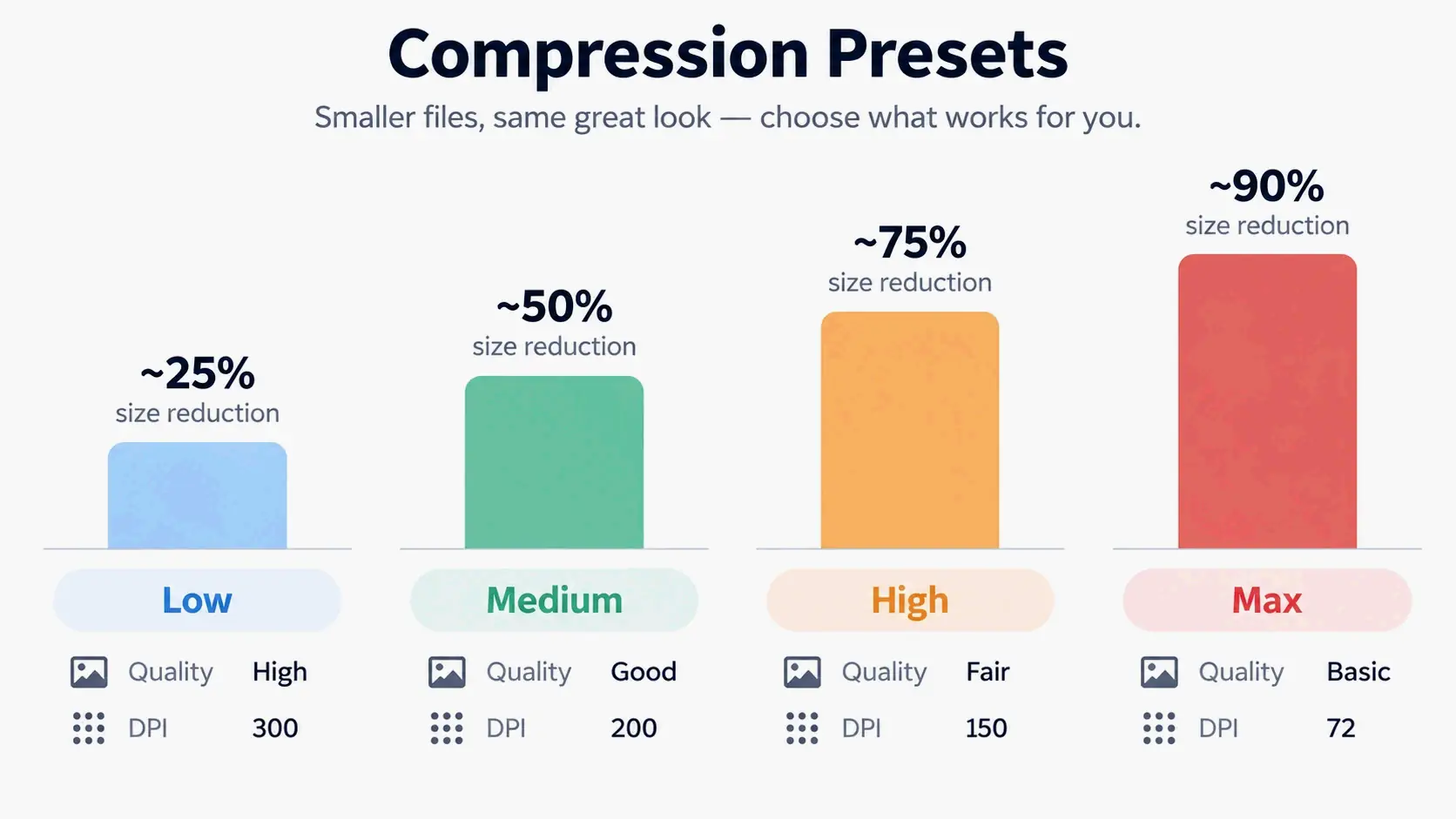
    The preset is the first real decision you make, because it sets the JPEG quality and the target DPI applied to embedded images. I7 Pixel publishes a preset comparison table that maps each level to a quality setting, a DPI target, and an expected reduction range:

    Preset JPEG Quality DPI Typical Size Reduction Best Used For
    Low 90% 300 DPI 10–30% High-fidelity, print-ready output
    Medium (default) 72% 96 DPI 40–70% General sharing, email attachments, web upload
    High 50% 72 DPI 60–80% Messaging apps and portals where small size matters
    Max 30% 72 DPI 75–90% Previews or cases where size is the only priority

    Compression presets compared: Low, Medium, High, Max with quality, DPI, and reduction

    A simple rule: printing or archiving → Low. Email and everyday sharing → Medium. A hard portal cap → High. Last resort before splitting the file → Max.

    DPI affects embedded bitmaps, not fonts. In most engines, your text stays vector at every level. That’s why Low is much safer than users who choose “compress nothing” might assume. PdfPixels describes the same three-tier setup—Low for print preservation, Medium as the email standard, and High for strict portal caps—and notes that its engine compresses text streams losslessly with FlateDecode while saving downsampling for raster image objects.

    Start with Medium: the default that clears most email and portal limits

    Medium is the default for a reason. It clears the most common size limits while keeping documents readable on screen. PdfPixels reports that Medium delivers 60–80% size savings while preserving 150 DPI image clarity, and calls it the “industry sweet spot” for standard email attachments.

    PurePDF frames the same choice as “Balanced,” which it says typically cuts 50–70% of file size with no visible difference on screen. Both tools save their most aggressive setting for when you must hit a hard number, such as a government portal limit.

    Is Free PDF Compression Really ‘Lossless’? What the Engine Is Actually Doing

    There are two engine families, yet the word “lossless” gets used for both. True lossless stream compression rewrites object streams, removes duplicate objects, and strips metadata without touching image pixels. That’s the pikepdf/QPDF route that OneClickPDF documents. The second family re-encodes images: it downsamples bitmaps to 150, 96, or 72 DPI and saves them again as JPEG. That’s where the 40–90% reductions come from—and where pages can get rasterized.

    The real numbers vary a lot. OneClickPDF reports that pure lossless compression yields only 10–40% reduction on text-heavy, font-embedded PDFs, with output that looks identical to the original. On the lossy side, PdfPixels reports that documents with 300+ DPI scanner photos typically shrink 60–90%, while text-only exports from Word or LaTeX shrink only 10–30%.

    Claims like “no quality loss, maintains 600 DPI+” on free tool pages are marketing copy. Some presets visibly do the opposite of what those lines promise, and none of these numbers are independently verified. Whatever the engine, the output is still a standard ISO 32000 PDF; what changes is which internal objects were replaced. PdfPixels says its engine conforms to ISO 32000-1 and ISO 32000-2, and PurePDF cites ISO 32000-2 (PDF 2.0) as its format reference.

    The 10-second text-selection test anyone can run

    Open the compressed file, click into a sentence, and try to select it. Then search for a word you know appears in the document. If the text highlights normally and the search returns hits, the text layer survived. If neither works, the pages were rasterized into images.

    This test matters because the result isn’t just cosmetic. TrulyFreePDF is unusually direct about its own behavior. It says compression “re-renders each page at an optimised resolution and image quality and rebuilding the PDF, so the output is image-based — its text is no longer selectable or searchable.” By contrast, PdfPixels says the vector text layer is never rasterized or degraded, so characters remain selectable and searchable by screen readers and OCR systems.

    When ‘no visible quality loss’ is technically false

    Run the check before you send the file, not after someone complains. Two things commonly break: photo detail at very low DPI, and text selection on raster-based tools.

    I7 Pixel is candid that on its image-recompression path, each page is rasterized as a JPEG, so text is rendered at the chosen DPI and encoded as an image. It recommends the Low preset at 300 DPI when text sharpness is critical. It also suggests disabling image re-compression entirely and only stripping metadata if you need the text layer intact. That’s the difference between a marketing claim and a documented behavior.

    How Much Smaller Will Your PDF Actually Get? Think 40–90% vs 10–40%

    Compression results fall into two very different ranges, depending on what’s inside the file. Image-heavy and scanned documents are the big winners: PdfPixels reports 60–90% reduction on 300+ DPI scans, noting that a 40 MB scan often drops to 3–5 MB. Bitmaps are what made the file large in the first place, so removing them is where the savings come from.

    Text-only PDFs exported from Word or LaTeX usually shrink just 10–30%, according to the same source. The fonts are lightweight vector commands, so there’s almost nothing heavy to remove. A purely lossless engine tops out around 10–40% on that same document type, according to OneClickPDF.

    PurePDF reports 40–90% as the general range across documents, depending on how many images a file contains (page last updated September 22, 2026). pdfFiller makes the same point without numbers: a PDF filled with images may see a much larger reduction than a text-heavy one, and reductions are minimal when the original is already optimized.

    The practical takeaway is simple. If a 2 MB text-only PDF must hit 200 KB, no compressor will get there by compression alone. That requires the step ladder in the next section. If your goal is simply fewer megabytes rather than an exact figure, see five fast ways to decrease the MB of a PDF.

    Hitting an Exact Size Limit: 200 KB, 500 KB, 1 MB, or 25 MB

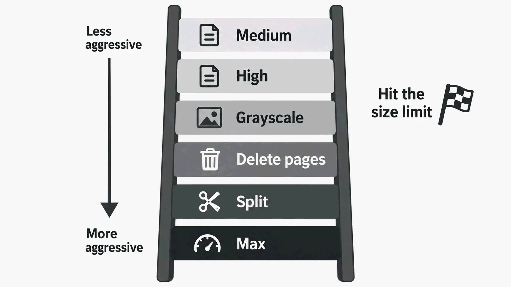
    A hard number changes the problem. Instead of asking “how small can this get,” you’re asking “which trade-offs do I accept to reach exactly this?” The answer is a ladder, ordered from least to most damaging, and you climb it one rung at a time.

    The six-rung ladder when you’re still over the cap

    1. Retry at Medium. If your first attempt used Low, the balanced preset usually covers the next tier of limits without visible change.
    2. Drop to High / 72 DPI. I7 Pixel maps High to 50% JPEG quality at 72 DPI and a typical 60–80% reduction.
    3. Convert to grayscale. PdfPixels recommends this exact sequence: start with High compression. If a 50-page document is still over target, convert it to grayscale first to remove color data channels, then run compression again.
    4. Delete blank or appendix pages. Removing pages you don’t need is the only rung that reduces content rather than quality.
    5. Split the file. PdfPixels points users to its Split PDF tool to remove extraneous appendices when text files must go smaller.
    6. Use Max and accept softer images. Save this for previews and archive thumbnails, not for anything a person has to read closely.

    Six-rung ladder for hitting exact PDF size limits: retry Medium, High, grayscale, delete pages, split, Max

    Grayscale is the most underused rung. Color scans carry chroma channels you don’t need for a text document. Dropping to gray can remove a large chunk of data that DPI reduction alone won’t touch.

    Email attachments: Gmail 25 MB and Outlook or corporate 10 MB

    Email is the most common reason people compress files in the first place. PdfPixels cites Gmail’s 25 MB attachment limit and a 10 MB threshold for Microsoft Outlook and many corporate servers. PurePDF gives the same figures and notes that messaging apps either compress or reject large files outright.

    Target playbook: 25 MB → Medium is almost always enough. 10 MB → Medium or High. That covers the overwhelming majority of attachment bounce-backs.

    Job portals and government forms: 200 KB–2 MB

    Portal caps go much lower than email caps. PurePDF notes that government and job portals often enforce limits as low as 1–2 MB, and PdfPixels describes job candidates compressing illustrated portfolio decks and resumes to meet 2 MB employer portal caps.

    At the 200 KB–500 KB end, compression alone often isn’t enough. That’s the tier where you combine High compression, grayscale, and splitting—or extract only the pages the recipient actually asked for.

    Court filings, immigration packets, and academic submissions

    These destinations combine low caps with high stakes. PdfPixels states that U.S. Federal Court CM/ECF and PACER systems generally mandate black-and-white or grayscale scanned documents at 300 DPI, with per-file size limits typically between 35 MB and 50 MB, and separately lists USCIS and consular portals at under 12 MB.

    Treat those numbers as vendor-sourced. PdfPixels doesn’t link an official court or agency source for either figure, so verify directly with the court or agency before relying on them. What’s safe to act on: grayscale at 300 DPI is the direction these systems push you toward, and Low or Medium compression keeps a scanned filing well within a typical cap.

    Academic repositories and journal portals add their own limits. PDNob lists dissertation uploads to ProQuest or university repositories and journal article sharing on ResearchGate as common scenarios. That’s a reminder that the cap you’re fighting is set by the destination, not by the file.

    Does a Free Browser PDF Compressor Upload Your File? Local vs Server Processing

    Client-side tools run the compression engine inside your browser—often a WebAssembly build of a desktop-grade engine—so the file never leaves your device. That’s the strongest privacy position available, and unlike most privacy claims, it’s verifiable: open your browser’s network tab and watch whether any upload happens while you compress a test file.

    PurePDF runs a WebAssembly build of Ghostscript, the engine used in professional print workflows, in your browser first and only sends a file to its server if the browser cannot shrink it. I7 Pixel uses PDF-lib and PDF.js entirely client-side and states that your document is never sent to any server.

    Server-side tools upload, process, and return the file. PdfPixels says uploaded files reside only in temporary volatile storage and are automatically removed within 60 minutes, protected by TLS 1.3. Those compliance labels are vendor self-descriptions and can’t be independently verified from the page alone.

    The real trade-off is capacity, not marketing. In-browser processing is limited by your device’s RAM and CPU. PurePDF states this directly: files in the hundreds of megabytes work on a desktop but may struggle on an older phone. Server tools accept larger inputs—50 MB at PdfPixels, 100 MB at pdfFiller and OneClickPDF—but the file leaves your device during processing.

    A workable decision rule: contracts, financial records, medical documents, or ID scans → client-side tool. Very large or numerous files → server tool with a published deletion policy.

    Why Won’t Your PDF Compress? Five Common Causes

    1. The PDF is password-protected or encrypted. The compression engine can’t parse encrypted streams at all. PdfPixels says password-protected or certificate-encrypted PDFs cannot be parsed directly and tells users to unlock the document first. OneClickPDF says the same, suggesting Adobe Acrobat, macOS Preview, or your PDF reader to remove the password before uploading.

    2. The PDF was already optimized. A file compressed before, or exported at low DPI, has little left to remove. pdfFiller notes that minimal reductions occur when the original file is already optimized.

    3. The PDF is text-only. PdfPixels reports that Word and Google Docs exports store typography as lightweight vector commands, leaving little raster data to compress — a realistic ceiling of 10–30%.

    4. The PDF carries a digital signature. Re-compression rewrites the byte stream and changes the cryptographic hash covered by the X.509 certificate, so an existing signature is invalidated. PdfPixels advises compressing first and applying electronic or digital signatures as the final step.

    5. The file exceeds the tool’s input ceiling. PDNob allows 15 MB per file, PdfPixels 50 MB, and pdfFiller and OneClickPDF 100 MB. If you’re over the limit, switch tools, split the document, or move to desktop software.

    Order of Operations: Compress First, Merge Second, Sign Last

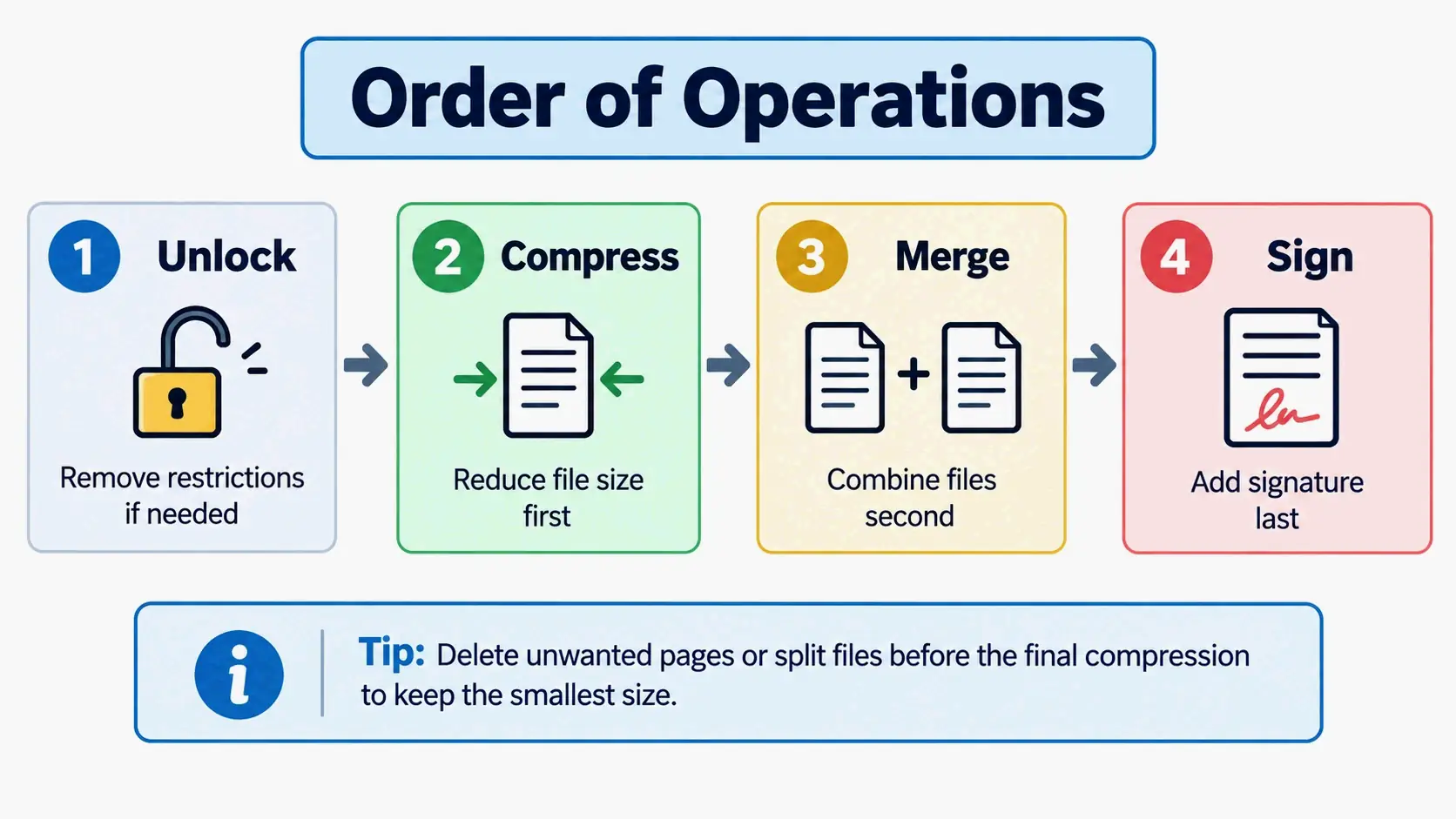
    Order matters more than tool choice. Get it wrong, and you either undo your savings or invalidate a signature you already applied.

    Compress before merging. PurePDF states the principle directly: smaller inputs make every downstream step faster, and compressing first keeps each file under per-file caps during the merge. Compressing after merging means processing one large file instead of several small ones.

    Sign after compressing. PdfPixels notes that re-compressing or modifying internal PDF stream structures can invalidate cryptographic digital signatures because the file’s cryptographic hash changes. Always compress first, then sign the final file.

    Unlock before compressing. Encrypted files cannot be parsed by the compression engine. Remove the password with your PDF reader, save a copy, then compress.

    Delete or split pages before the final pass. Saving a file you already compressed adds overhead and can undo part of your savings. Do the content edits first, then run one compression pass on the finished document.

    Correct order of operations: compress, merge, sign — with unlock and edit steps integrated

    Free Online Tool, Desktop Software, or Phone App: Which Fits Your File?

    Browser tools win on speed and zero install for one or two files, but free tiers differ sharply, so compare file limits rather than taglines — the same trade-offs you face when compressing PDFs on every platform. The gap is wide: PDNob caps free online uploads at 15 MB, PdfPixels at 50 MB, and pdfFiller and OneClickPDF at 100 MB.

    Desktop software gives you batch processing, precise DPI control, and fully offline operation — the right call for hundreds of pages or confidential documents. Wondershare PDFelement offers one-click high, medium, and low presets plus manual DPI adjustment, bulk compression, and additional reduction methods such as splitting files, replacing or deleting large images, and changing colors. macOS users have a built-in option too: PDNob’s FAQ points to Preview’s File > Export > Quartz Filter > Reduce File Size path. For the desktop route in more depth, see five free ways to compress a PDF for Mac and Windows.

    The engines behind the interface matter more than the interface itself. Ghostscript compiled to WebAssembly powers some in-browser tools, while pikepdf/QPDF and PDF-lib appear in others. Either way, the output remains a standard ISO 32000 PDF, which is why any compliant viewer can open it.

    One trust signal worth citing, with a caveat: as of September 2026, pdfFiller reports a 4.6/5 rating across 125,000+ G2 reviews. That’s useful as a user-satisfaction signal, not as evidence of compression performance.

    Phone apps are fine for a single photo-heavy scan on the go — here’s how to compress a PDF on iPhone in three quick ways. But app-store listings often omit version and update dates, so don’t expect documented performance claims to hold. For context on why workflow matters at all, Marshall Orthopaedics reported that manual form-filling cost 30–60 minutes per patient’s paperwork. That figure is about document workflow time, not compression—read it only as a reminder that workflow cost generally exceeds file-size cost.

    Conclusion

    A free PDF compressor will shrink image-heavy files 40–90% in seconds, but the word “lossless” is doing a lot of unpaid work. Knowing whether your tool rewrites streams or re-encodes images—and in what order you compress, merge, and sign—decides whether the result is usable. Start at Medium, run the 10-second text-selection test on the output, and if you’re still over the cap, climb the ladder one rung at a time: High, grayscale, delete pages, split. For sensitive or very large files, choose your processing model (in-browser vs. server) before you choose your tool.

    FAQ

    Can I compress a password-protected PDF for free, or do I have to unlock it first?

    You have to unlock it first. Encryption stops the compressor from reading the file’s internal streams, so the tool can’t process it at all. Free compressors generally won’t ask for a password—decryption is a separate step. Unlock or decrypt the file in your PDF reader, save a copy, then run the compressor on the unlocked version.

    Will compressing a PDF make the text unselectable or blurry?

    Not with lossless engines. Those rewrite only streams and duplicate objects, so text stays selectable and searchable. Aggressive presets on image-recompression engines can rasterize whole pages into JPEGs, which breaks text selection entirely. Verify in 10 seconds: open the compressed file, try to select a sentence, and search for a word you know is in the document.

    Does compressing a PDF break an existing digital signature?

    Yes. Re-compression rewrites the byte stream and changes the cryptographic hash the X.509 signature covers, so the signature will show as invalid even if nothing visible changed. Compress first, then sign the final file. Apply electronic or digital signatures as the last step in your workflow, never before a compression pass.

    Why won’t my text-only PDF shrink below 1 MB?

    Word and LaTeX exports store text as lightweight vector fonts, so there’s very little bitmap data to compress. A realistic reduction is 10–30% with an image-recompression engine and 10–40% with a lossless one. To go lower, convert to grayscale, remove blank or unnecessary pages, or split the file into smaller parts.

    Is a free browser-based PDF compressor private — does my file get uploaded to a server?

    It depends on the tool. Client-side compressors run entirely in your browser and never upload the file. Some server-side tools do upload it, and a few publish an auto-purge window, such as 60 minutes. Check the claim yourself: open your browser’s network tab and watch whether an upload happens while you compress a test file.

  • What Is an IMEI Number? Meaning, Format & How to Find It

    What Is an IMEI Number? Meaning, Format & How to Find It

    Header: IMEI as a hardware identity for a cellular device

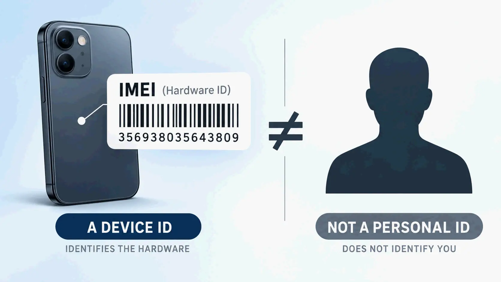
    An IMEI (International Mobile Equipment Identity) is a 15-digit number that identifies a specific cellular device — not its owner and not its phone number. Networks use it to authorize hardware, and U.S. carriers can blocklist a stolen IMEI. To find yours, dial *#06# or check your Settings.

    What Is an IMEI Number?

    IMEI stands for International Mobile Equipment Identity. It’s a numeric identifier, usually unique, assigned to 3GPP and iDEN mobile phones, and it also appears on some satellite phones (Wikipedia). A standard IMEI has 15 digits. The numbering space is managed under rules published by the GSMA, the industry association that defines how IMEI ranges are allocated to device makers.

    The identifier is tied to the hardware, not to an account. Swapping a SIM card, switching carriers, changing your phone number, or performing a factory reset does not produce a new IMEI. Only replacing the device itself gets you a different one.

    Almost anything that connects to a cellular network carries an IMEI: smartphones, cellular tablets, cellular smartwatches, some laptop cellular modules, and satellite terminals. The Broadband Global Area Network (BGAN), Iridium, and Thuraya satellite networks all use IMEIs on their transceiver units, and the Iridium 9601 modem relies solely on its IMEI for identification with no SIM card at all (Wikipedia).

    A GSM network reads the IMEI when a device first attaches. It uses that number to decide whether the specific piece of hardware is allowed to access the network. A phone reports the number when the network asks for it, and operators may request it to check whether a device is damaged, reported stolen, or associated with fraud or faults (Phone Scoop).

    What an IMEI does not contain: no name, no address, no billing details, no phone number. That absence is exactly what separates it from the identifiers most people confuse it with.

    What Does an IMEI Number Identify — the Device or Its Owner?

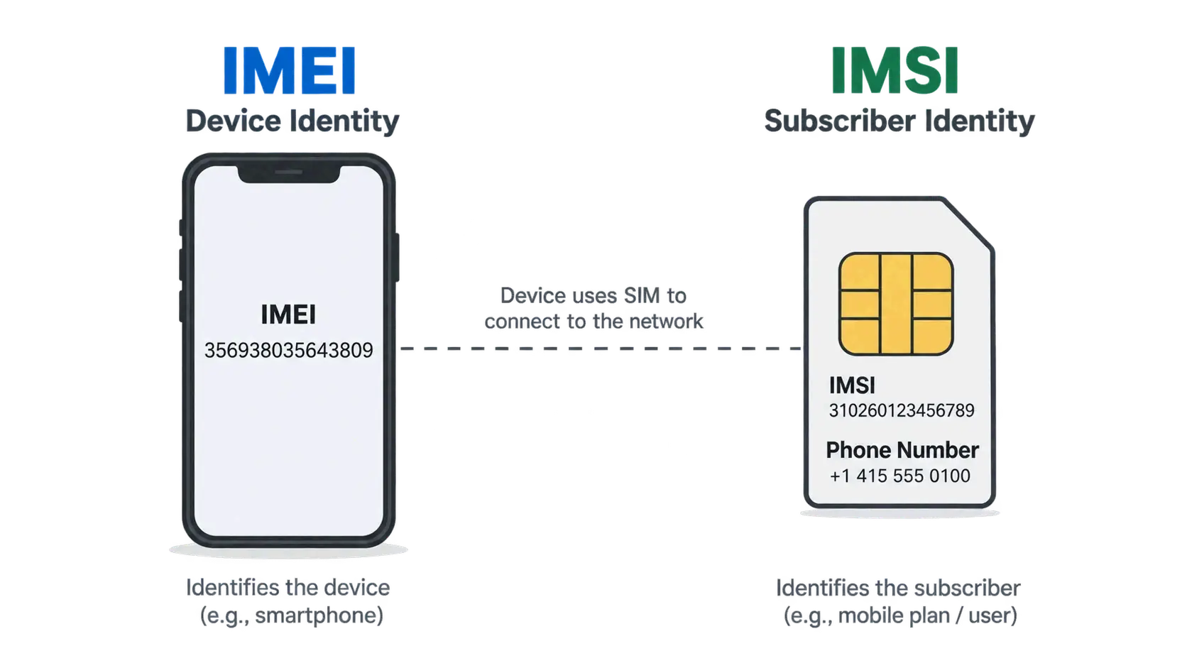
    It identifies the device — and only the device. An IMEI does not point to a person, an account, or a phone number. It identifies the physical radio hardware.

    That distinction matters because several different identifiers can appear on the same phone at the same time. Each one answers a different question.

    Identifier What it identifies Where it lives Does it change?
    IMEI The cellular device In the device firmware/hardware No — survives SIM swaps, carrier changes, and factory resets
    IMSI The subscriber On the SIM card or eSIM profile Yes — it belongs to the SIM, not the phone
    Phone number (MSISDN) The subscription line Carrier network and account records Yes — it changes with a new line or a port
    SIM card The subscription module itself Physical SIM or eSIM chip Yes — replacing the SIM replaces this identity

    Device identity vs subscriber identity: IMEI on hardware, IMSI/SIM for subscriber

    Because the IMEI lives in the hardware, it stays the same no matter whose SIM is inside. The phone identifies the subscriber separately by transmitting the International Mobile Subscriber Identity (IMSI), which is stored on the SIM card and can in theory be moved to any handset (Wikipedia). That’s why a carrier can recognize a device without knowing who is using it, and recognize a subscriber without caring which handset they inserted the SIM into.

    IMEI vs. IMSI: Device Identity vs. Subscriber Identity

    The IMEI is a hardware label; the IMSI is a subscription label. A network authenticates the IMSI, not the IMEI — the SIM proves who the subscriber is, while the IMEI simply declares what the device is.

    In practice, the two can be separated. Move a SIM from one phone to another, and the IMSI stays the same while the IMEI changes completely. Leave the SIM in place and swap the phone number on your account, and the IMEI is untouched. The two systems are designed to describe different things, and they are not interchangeable in any carrier support conversation.

    Why an IMEI Is an Unauthenticated Identifier

    An IMEI is an unauthenticated mobile identifier, in contrast to the IMSI, which home and serving networks routinely authenticate (Wikipedia). The device reports it, and the network generally takes that report at face value rather than cryptographically proving it.

    Two consequences follow. First, an IMEI can be spoofed or cloned, which is why it cannot serve as an identity credential on its own. Second, and more useful in daily life, blocklisting targets the hardware itself: a thief who pulls the SIM out of a stolen phone and puts it into a different handset still cannot use the stolen device on any participating network, because the blocked hardware is the thing being refused.

    The identifier also cuts both ways. Saudi Arabian government agencies have reportedly used IMEI numbers taken from cell phone packaging to locate and detain women who fled the country (Business Insider, 2019). The IMEI itself carried no personal data — it was combined with other information to become a tracking pivot.

    The 15-Digit IMEI Format: TAC, Serial Number, and Check Digit

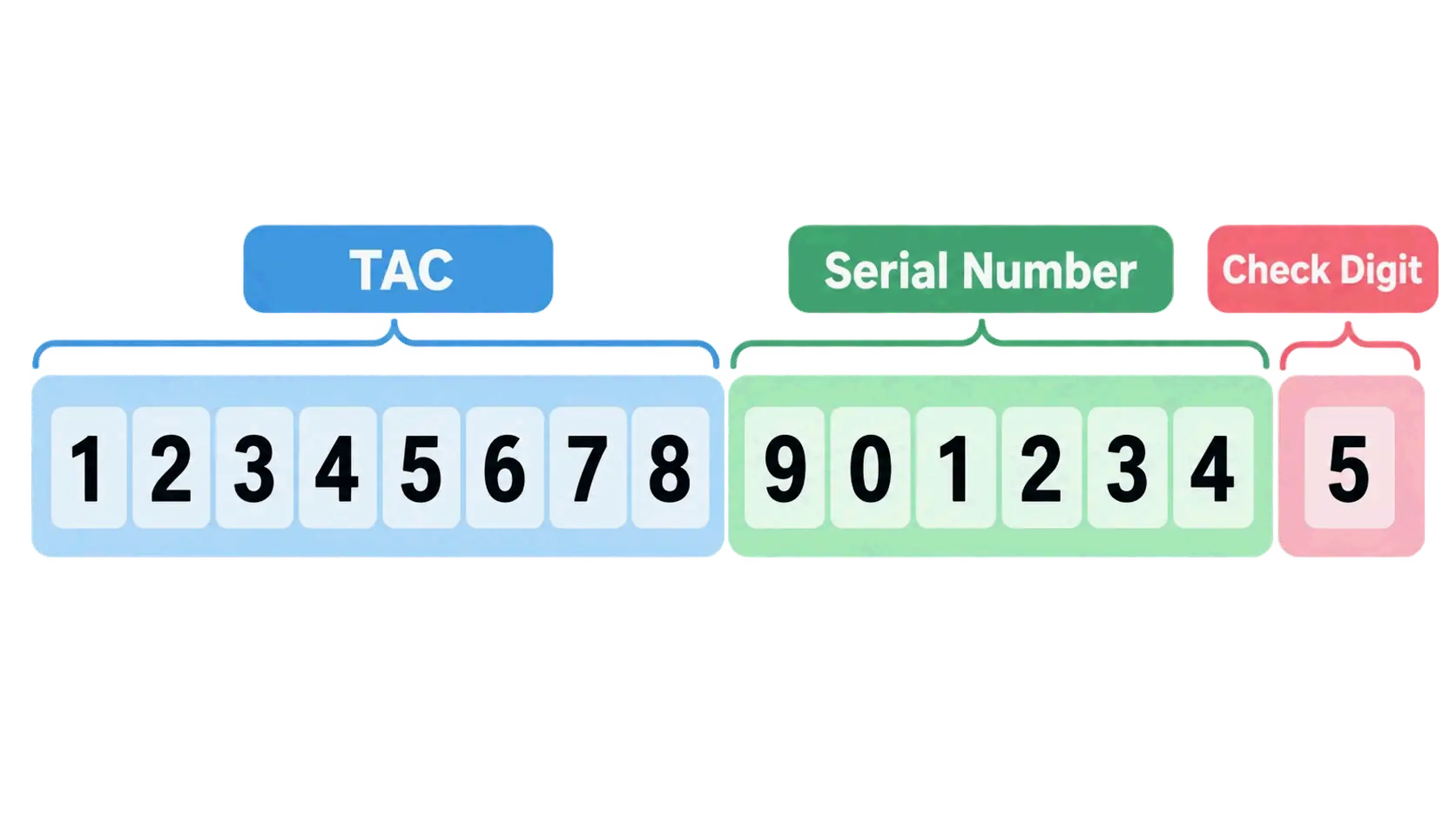
    A standard IMEI is 15 decimal digits, and the structure is formally specified in 3GPP TS 23.003. The number is not random: it breaks into three parts that together describe the allocation, the individual unit, and a mathematical validity check. The display format is often written as AA-BBBBBB-CCCCCC-D, though devices frequently show it as one unbroken string.

    The 15-digit IMEI split into TAC, serial number, and check digit

    Digits 1–8: The Type Allocation Code (TAC) and RBI

    The first eight digits form the Type Allocation Code (TAC), which is tied to the origin and model of the device. The TAC is allocated by the GSMA to the brand owner for an approved device type, and phones in the same model family can share a TAC while differing in the digits that follow.

    Within those eight digits, the first two are the Reporting Body Identifier (RBI). The RBI identifies which GSMA-approved group allocated the TAC, and RBI numbers themselves are assigned by the Global Decimal Administrator (Wikipedia). An older-style IMEI such as 35-209900-176148-1 shows RBI code 35 — issued by BABT — with allocation number 2099.

    Digits 9–14: The Device Serial Number

    Digits 9 through 14 are the serial number portion, chosen by the TAC holder to distinguish one unit from another within that allocation (Aikon). This is not the same thing as the manufacturer’s device serial number printed elsewhere on the phone or the box, even though both use the word “serial.” Six digits give roughly a million individual units under a single TAC before a new allocation is needed.

    Digit 15: The Luhn Check Digit

    The fifteenth digit is a check digit calculated with the Luhn algorithm, the same checksum used on payment card numbers under ISO/IEC 7812. Its purpose is narrow but useful: it guards against incorrect entries into Equipment Identity Register and Central Equipment Identity Register systems (Wikipedia). The check digit is not transmitted over the radio interface and is not stored in the EIR database.

    The arithmetic is straightforward. Take the first 14 digits, double every second digit starting from position 2, subtract 9 from any doubled value greater than 9, add everything up, and the check digit is whatever you must add to reach the next multiple of ten. Worked through for the base 35316105214284:

    Position 1 2 3 4 5 6 7 8 9 10 11 12 13 14
    Digit 3 5 3 1 6 1 0 5 2 1 4 2 8 4
    Value added 3 1 3 2 6 2 0 1 2 2 4 4 8 8

    The sum is 46, the next multiple of ten is 50, so the check digit is 4 and the complete IMEI is 353161052142844 (Aikon). Change any single digit and the total stops being a multiple of ten, which is precisely what the checksum is designed to catch.

    What the check digit cannot do is prove that a device exists, that it belongs to the seller, or that it has a clean network status. It validates format, not truth.

    IMEISV: When an IMEI Shows 16 Digits

    If you see 16 digits, you are most likely looking at an IMEISV — International Mobile Equipment Identity and Software Version. The IMEISV keeps the 8-digit TAC and 6-digit serial but replaces the Luhn check digit with a two-digit Software Version Number, giving the format AA-BBBBBB-CCCCCC-EE (Wikipedia). A software version of 99 is reserved.

    IMEISVs show up in diagnostic screens and in exports from repair systems. If a lookup service asks specifically for an IMEI and you paste a 16-digit IMEISV, the result may be rejected or simply wrong.

    How the IMEI Format Changed (and Why the Year Matters)

    The current 8-digit TAC is a post-2004 standard, and older references still describe the previous layout. Before 2002, the TAC was six digits followed by a two-digit Final Assembly Code (FAC), a manufacturer-specific code indicating where the device was assembled. From January 1, 2003 until April 1, 2004, the FAC for all phones was 00, marking the transition period. After April 1, 2004, the FAC ceased to exist and the TAC grew to eight digits (Wikipedia).

    Separately, the link between regulatory approval and IMEI allocation was removed in April 2000 with the introduction of the European R&TTE Directive. Since then, having a formally allocated IMEI range has not meant a device is approved or compliant — a point worth remembering when a listing claims an IMEI “proves” regulatory certification.

    How to Find Your IMEI Number on Any Device

    There are five reliable places to find an IMEI, and they are not equally useful in every situation. The fastest works only if the phone turns on. The slowest works when the phone is gone.

    Dial *#06# — the Fastest Method

    Open the phone dialer and enter *#06#. The IMEI appears on screen immediately, and on many devices this works even from the lock screen. On a dual-SIM phone you will typically see IMEI 1 and IMEI 2 displayed together, so you can capture both in one step (imeichanger.net). No app, no menu navigation, no account login.

    Android and iPhone Settings Paths

    If the dialer code is blocked or you prefer a menu, both major platforms expose the number:

    • Android: Settings → About Phone (the exact wording varies by manufacturer — Samsung, Google Pixel, Xiaomi, Motorola, and OnePlus all label this section slightly differently).
    • iPhone: Settings → General → About.

    On both platforms the IMEI appears alongside other identifiers, including the serial number and, on eSIM-capable models, the EID. Read the label next to each value rather than assuming the longest number is the IMEI.

    When the Phone Won’t Turn On: Box, Invoice, and Carrier Records

    A dead, damaged, or stolen phone cannot display anything, so the IMEI has to come from outside the device. The available sources are the original retail packaging or label, the purchase invoice or receipt, carrier account records, insurance documents, and previous repair documentation.

    Reliability differs sharply here. The box is convenient but not trustworthy on its own — packaging can be counterfeited or swapped between devices. Whenever the phone still powers on, compare the printed number against what *#06# displays. If the two disagree, treat that as a serious warning sign rather than a clerical error.

    One habit is worth building now: write your IMEI down and store it somewhere other than the phone itself — a cloud note, a password manager, or a paper record. Storing it only inside the device defeats the purpose the moment the device is locked or gone.

    Why a Dual-SIM Phone Shows Two IMEI Numbers

    Two IMEIs on one phone is normal, not a defect. Dual-SIM phones normally carry two IMEI numbers because each cellular connection needs its own device identifier (Wikipedia). IMEI 1 and IMEI 2 correspond to the two separate cellular interfaces inside the same physical handset.

    The practical implication is easy to miss: when reporting a phone lost or stolen, provide both numbers so carriers and law enforcement can blocklist both connections. When checking a used phone, do not verify only one IMEI and assume the result covers the whole device.

    Apple Watch, eSIM-Only Devices, and Other Exceptions

    Not every connected device has an IMEI, and the exceptions trip people up. Wi-Fi-only tablets, laptops, and other non-cellular hardware have no IMEI at all. For Apple Watch, IMEI is available on GPS + Cellular models only (Apple Support, updated September 14, 2026); a GPS-only Apple Watch carries a serial number but no IMEI.

    Devices that use eSIM instead of a physical SIM tray usually still have an IMEI, and they typically have an EID as well. The two numbers identify different pieces of hardware: the IMEI covers the device, the EID covers the eSIM chip. Apple Watch owners can read either value on the watch under Settings → General → About, or on a paired iPhone through the Apple Watch app under My Watch → General → About (Apple Support).

    What an IMEI Number Is Actually Used For

    Beyond simply naming a device, the IMEI supports several practical processes that all depend on one property: it distinguishes this specific unit from every other unit of the same model, color, and storage size.

    • Carrier activation and network authorization. When a device first joins a network, its IMEI is registered so the carrier can determine whether that hardware is permitted on the network.
    • Warranty and repair verification. Official and third-party repair points use the IMEI to confirm the model, the parts involved, and the warranty status of the exact unit on the bench.
    • Device insurance claims. Insurers use the IMEI as the unique identifier for the item being claimed, which is why the number belongs on your policy documents.
    • Network troubleshooting. A carrier can use the IMEI to check whether a device has recently registered successfully with a cell site, which helps separate a device problem from a coverage or account problem.
    • Second-hand transaction verification. Buyers compare the IMEI shown by the device against the seller’s number and check reported status before paying.
    • Law enforcement investigation. Device identifiers can survive physical destruction, making them a durable investigative lead.

    Note what is missing from that list: none of these uses require the IMEI to reveal who owns the phone.

    How Law Enforcement Uses IMEI Numbers

    An IMEI can serve as an investigative starting point even when the device itself is destroyed. An IMEI recovered from the remnants of a Nokia 5110 was used to trace and identify the perpetrators of the 2002 Bali bombings (ABC News). Because the number is tied to hardware rather than to a SIM, it can remain recoverable and meaningful after the components around it are gone.

    The same capability explains why the IMEI shows up in debates about surveillance. Law enforcement and intelligence services can use an IMEI as an input for tracking devices that locate a cell phone with accuracy of a few meters (Wikipedia) — a capability that exists on the network side, not in any consumer tool.

    Lost, Stolen, or Blocked: How IMEI Blocklisting Works

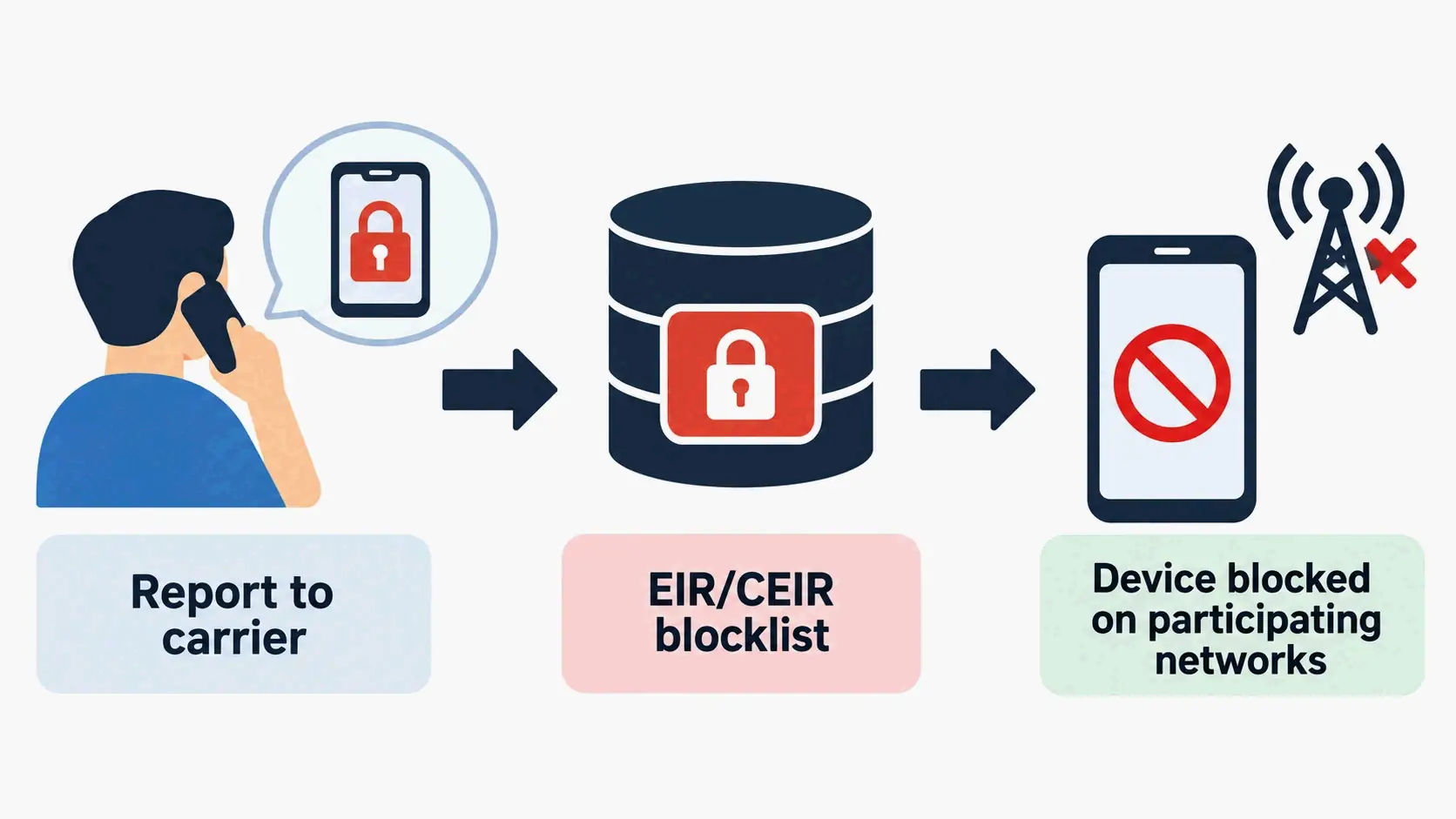
    Blocklisting is the mechanism that turns an IMEI into a theft deterrent. When a device is lost or stolen, the owner can ask their service provider to block the phone from the network. If the local operator maintains an Equipment Identity Register (EIR), it adds the device IMEI to that register. Optionally, it also adds the IMEI to a shared registry such as the Central Equipment Identity Register (CEIR), which blocklists the device with every other operator using that system (Wikipedia).

    The result is that the handset becomes unusable on any operator connected to the CEIR, which removes most of the value from phone theft — apart from reselling the parts.

    Reporting a stolen IMEI to carrier then EIR/CEIR blocklisting

    What Happens the Moment a Carrier Blocklists an IMEI

    The cellular identity of the device stops working. Calls and mobile data are refused on participating networks, and the block follows the hardware rather than the SIM, so inserting a new SIM does not restore service.

    Two limits are worth stating plainly. First, Wi-Fi still works: a blocklisted phone can still run apps, browse, and make VoIP calls over a wireless network. Second, a blocklisted phone retains value as parts. Blocklisting also depends on the IMEI being difficult to change, and in practice a phone’s IMEI may be changeable with special tools (Wikipedia) — this is exactly why the IMEI is described as unauthenticated. In some jurisdictions, an IMEI can also be removed from a blocklist under local arrangements, typically by quoting a password chosen when the block was placed.

    There is a broader caveat about effectiveness: it remains unclear whether local barring produces a net positive effect, since it may simply push stolen phones into international smuggling channels (Wikipedia).

    EIR and CEIR: How Blacklists Travel Between Networks

    An EIR is a carrier-side database. A CEIR is the shared layer that lets one operator’s block reach other operators’ networks. Without that shared layer, blocklisting would only work on the network that recorded it, and a thief could move a stolen handset to a competitor.

    Cross-border coordination has been in place for a long time. Australia was the first nation to implement IMEI blocking across all GSM networks, in 2003. In the UK, a voluntary charter operated by the mobile networks ensures that any operator’s blocklisting of a handset is communicated to the CEIR and then to all other networks, making the handset unusable for calls within at most 48 hours (Wikipedia).

    Blocklists are also used for compatibility rather than theft. After Australia’s 3G network shutdown, all 4G and 5G devices not approved for use in Australia by the carriers are IMEI- and/or TAC-blocked, and users cannot request removal even if they can demonstrate the device is technically compatible (Wikipedia). That is a TAC-level block, which affects an entire model range rather than a single unit.

    How to Report a Lost or Stolen Phone Step by Step

    Move through these three steps in order, because each one produces a record the next one needs.

    1. Contact your carrier. Ask them to blocklist the IMEI on your account. Provide both IMEI 1 and IMEI 2 if the phone is dual-SIM.
    2. File a police report and get a case number. The case number is what insurance companies and carriers typically ask for, and it creates an official record of the theft.
    3. Notify your insurer. Your policy documents should already contain the IMEI; if they do not, supply it now.

    If you are in the United States and want to confirm a device’s reported status before or after any of this, the CTIA refers consumers to stolenphonechecker.org and to the GSMA device check, where you can check whether a smartphone has been reported lost or stolen to member carriers (Wikipedia).

    The U.S. Context: Blocklists, Not Whitelists

    The United States runs a blocklist model, not a whitelist model. Under a blocklist, a device is presumed usable unless someone has reported it; under a whitelist, a device must be registered in the country before it can access local networks at all. Chile, Turkey, Tunisia, Azerbaijan, Colombia, Nepal, and Egypt are among the countries using allowlists, with various exceptions for international roaming and registration grace periods, and India, Pakistan, Indonesia, Cambodia, Thailand, Iran, Nigeria, Ecuador, Ukraine, Lebanon, and Kenya have adopted some form of mandatory IMEI registration (Wikipedia).

    The U.S. mechanism has a specific starting date. GSM carriers AT&T and T-Mobile began blocking newly reported IMEIs in November 2012; thefts reported before that date were not added to the database (Wikipedia). That cutoff explains a common frustration: an older stolen handset may never appear in a lookup simply because the report predates the system.

    A frequent error in older articles is describing Sprint’s approach as the American norm. Before its merger with T-Mobile, Sprint used an allowlist under which users had to register their IMEI and SIM card before an LTE-capable device could be used, despite no U.S. law requiring it — and had to re-register whenever they changed devices. T-Mobile, by contrast, uses a blocklist, including for former Sprint customers and select Sprint-sold devices. Treating Sprint’s old allowlist as a current U.S. rule is wrong.

    For consumers, the available public entry points are the CTIA stolen phone checker and the GSMA device check. Both report only what has already been reported to participating carriers. As of 2026, the United States has no nationwide, consumer-facing IMEI registry that returns real-time device status or owner information — a clean result from a public checker means “not reported,” not “verified.”

    How to Check an IMEI Before Buying a Used Phone

    Before anything else, separate two things that are routinely conflated: an IMEI lookup and a blacklist check. An IMEI lookup decodes the number and returns information tied to the device type. A blacklist check queries reported or restricted status in relevant databases. A lookup that returns a model name says nothing about whether the phone was reported stolen.

    What an IMEI Lookup Actually Returns

    A lookup can surface the manufacturer, device model, device type, and blacklist-related information, alongside other technical details — but there is no universal database that guarantees identical results for every phone (imeichanger.net). Results depend on the country, the carrier, the device model, the database being queried, the service provider, the age of the device, and what information is actually available to that service.

    One limitation is worth stating precisely. The Luhn check digit confirms only that a number is structurally self-consistent. It cannot establish that the device exists, that it belongs to the person selling it, or that it has a clean history. Format validity and device cleanliness are different claims, and a fabricated number can be built to pass the checksum. A 15-digit number can look perfectly normal while being the wrong number for the phone being sold.

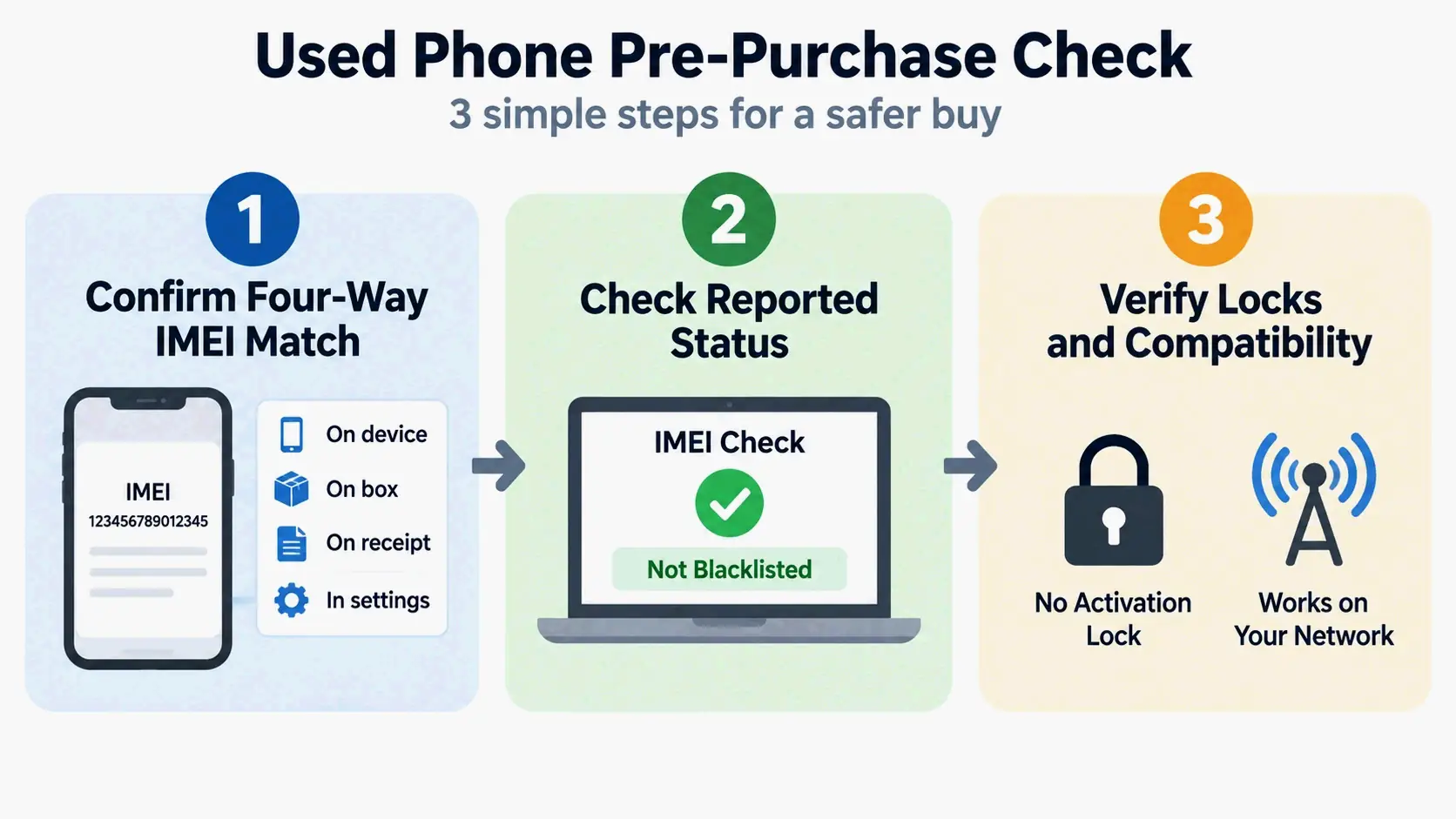
    The Pre-Purchase IMEI Checklist

    Work through this list before money changes hands. Each item catches something the others miss.

    1. Confirm the four-way match. The IMEI shown on the device via *#06#, the IMEI the seller quoted, the IMEI on the box, and the IMEI on the invoice or documentation must all agree. Any mismatch ends the conversation.
    2. Check reported status yourself. Run the number through the CTIA stolen phone checker or the GSMA device check rather than trusting a screenshot from the seller. Screenshots are trivially edited.
    3. Confirm activation locks are off. Verify that Find My (Apple) or the corresponding Google account lock has been removed, and that the device can be set up from scratch.
    4. Verify carrier and band compatibility. Confirm the model works on your carrier’s network, particularly for voice over LTE, before you buy.
    5. Ask for proof of ownership. An original receipt or a written transfer record matters more than any single lookup result.

    Three-step pre-purchase IMEI check: match, status, locks

    Finally, be clear about what the IMEI check does not replace. A clean IMEI does not mean the phone is free of debt, free of an activation lock, or free of internal damage. It is one input among several, not a guarantee.

    IMEI vs. Serial Number, Phone Number, MEID/ESN, and EID

    Four identifiers get mixed up with the IMEI constantly. The differences are structural, not cosmetic.

    IMEI vs. Serial Number

    The IMEI is a network-side identity used to authorize a cellular device on a network. The serial number is a manufacturer’s asset tag used for warranty, service, inventory, and technical support (imeichanger.net). A smartphone commonly has both, plus a model number.

    Apple Watch illustrates the split cleanly. On GPS + Cellular models, Apple Support lists both a serial number and an IMEI; on models without cellular, only the serial number appears (Apple Support). Do not paste a serial number into a field that asks for an IMEI — the formats and the databases behind them differ.

    MEID and ESN: The CDMA Legacy in the U.S.

    Older CDMA phones used an ESN (Electronic Serial Number) and later a MEID (Mobile Equipment Identifier) rather than an IMEI (Phone Scoop). The MEID uses the same basic format as the IMEI but allows more flexibility in allocation sizes and usage, and it is hexadecimal rather than decimal — a MEID always begins with 0xA0 or a larger hexadecimal value, which is one quick way to tell the two apart (Wikipedia).

    In the U.S., these identifiers still appear in older documentation and in the records of devices from the CDMA era. As carriers migrated to LTE, IMEI became the dominant device identifier, and MEID and ESN gradually receded. Seeing a MEID today usually means you are dealing with an older device or an older record.

    eSIM and EID

    An EID identifies an eSIM chip. It is not an alternative to the IMEI and does not replace it — an eSIM-capable phone typically displays both, because the two numbers describe different hardware. The IMEI identifies the device; the EID identifies the embedded SIM.

    The simple way to keep four identifiers straight: IMEI and MEID identify the device, IMSI and EID relate to subscriber-side identity, and the serial number identifies the manufacturer’s asset.

    Two Things an IMEI Cannot Do

    Two persistent myths generate more confusion than any other IMEI topic. Both are worth correcting directly.

    Myth 1: Can an IMEI Track Your Phone in Real Time?

    No. An IMEI is a device identifier, not a positioning system. It contains no GPS capability and no location data, and an ordinary IMEI lookup will never return live coordinates. Any website promising that a 15-digit IMEI alone will show a phone’s exact current location should be treated as a red flag.

    What is true is narrower. A carrier can tell, on the network side, roughly which cell site a device is attached to, and law enforcement and intelligence services can use an IMEI as an input for tracking systems with accuracy of a few meters (Wikipedia). That is an internal network and investigative capability, not a consumer tool. To locate your own lost phone, use the official device-location service for your platform and contact your carrier.

    Changing an IMEI is not an “unlock trick,” and tools marketed as IMEI generators are not the same thing. A generator built for QA work produces random but format-valid numbers using a real 8-digit TAC, a 6-digit serial, and a computed check digit, and its own documentation states the generated numbers are intended strictly for testing and educational purposes and should not be used to alter or clone real device identifiers (TestMu AI). It exists so testers can simulate devices without touching real hardware — the same reason QA teams use random phone number generators for SMS-verification testing.

    On the law, the United States is different from the UK. Under the UK’s Mobile Telephones (Re-programming) Act 2002, changing the IMEI of a phone — or possessing equipment capable of changing it — is an offense under some circumstances (Wikipedia). In the United States, a bill introduced by Senator Chuck Schumer in 2012 would have made changing an IMEI unlawful, but it was not enacted. There is therefore no dedicated federal IMEI-rewriting statute, though rewriting typically accompanies fraud, and fraud and telecommunications laws can still apply. IMEI modification should never be treated as a way to defeat a blocklist.

    Conclusion

    An IMEI identifies the hardware in your hand — never the person holding it — and that single distinction drives everything from carrier activation to theft blocklisting.

    Take thirty seconds now to record yours. Dial *#06# and screenshot it, or copy the number off the box or invoice, then store it somewhere outside the device: a cloud note, a password manager, a paper record. If your phone is lost, stolen, or simply won’t power on, that 15-digit number is the only thing that proves which device is yours when you call your carrier, file a police report, or submit an insurance claim. Before buying a used phone, run its IMEI through the CTIA or GSMA official checker first.

    FAQ

    Can an IMEI number track my phone’s location or show where a lost phone is?

    No. An IMEI is not a positioning system and carries no GPS data. A free IMEI lookup returns model and TAC information, not a live location. Carriers can judge roughly which cell site a device is attached to, but that is an internal network capability that consumers cannot access. Use your platform’s official device-location service instead.

    Can I find my IMEI if my phone is lost, stolen, or won’t turn on?

    Yes, but only from sources outside the device: the original packaging, the purchase invoice, carrier account records, and insurance documents. iPhone users can find it in the device list on their iCloud account, and Android users can check their Google account’s device page. Recording your IMEI in advance shortens the reporting process considerably, so save a screenshot somewhere other than the phone.

    Why does my phone show two IMEI numbers?

    Because it is a dual-SIM device, and each SIM slot has its own independent hardware identity. IMEI 1 and IMEI 2 correspond to the two cellular connections, and dialing *#06# displays both at once. Some models that support eSIM show two physical-slot IMEIs plus an additional IMEI associated with the eSIM profile.

    Does changing my SIM card or phone number change my IMEI?

    No. The IMEI is bound to the hardware, while the SIM card and phone number are bound to the subscription. Swapping SIM cards, changing your number, switching carriers, and performing a factory reset all leave the IMEI untouched. Only replacing the device itself gets you a new IMEI.

    There is no dedicated federal ban — the 2012 bill that would have prohibited it was not enacted. However, rewriting an IMEI usually accompanies fraudulent intent, which can trigger telecommunications fraud and related laws. By comparison, the UK’s Mobile Telephones (Re-programming) Act 2002 explicitly makes changing an IMEI a criminal offense in certain circumstances.

    Which devices don’t have an IMEI at all?

    Wi-Fi-only tablets, laptops, and other non-cellular devices have no IMEI. Apple Watch provides an IMEI only on GPS + Cellular models; the non-cellular version has just a serial number. Devices that rely on eSIM typically carry both an IMEI and an EID, since the two numbers identify different hardware components.

  • LTR to RTL: A Complete Conversion Checklist

    LTR to RTL: A Complete Conversion Checklist

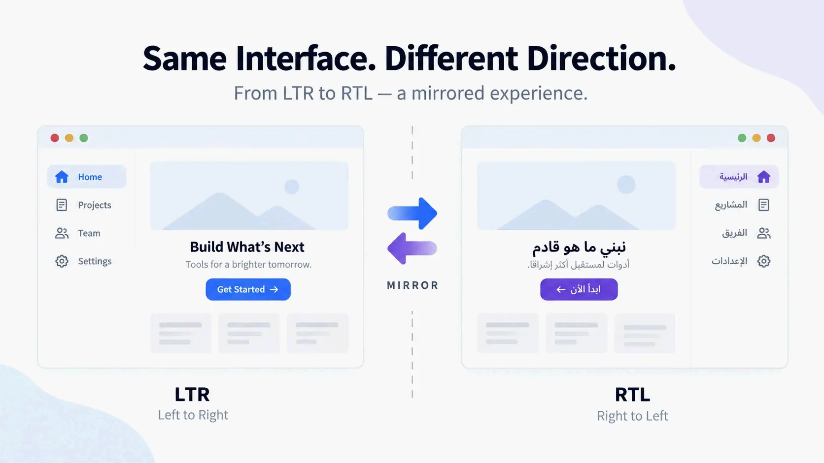
    Hero image: LTR to RTL interface mirroring concept

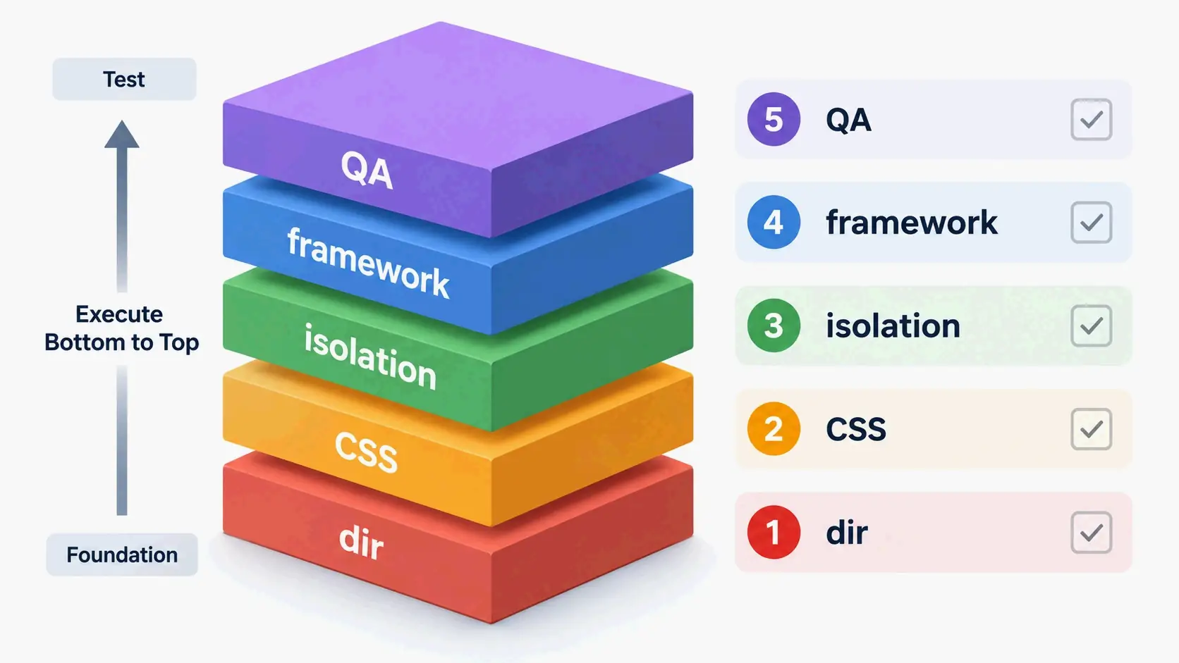
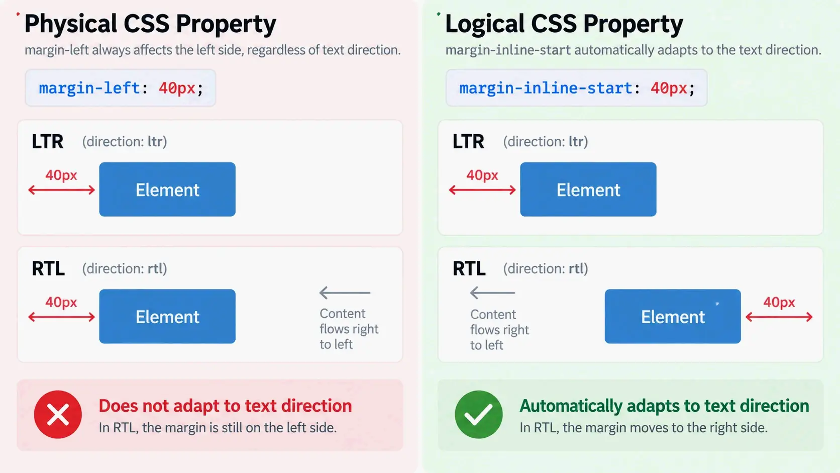
    To convert an interface from LTR to RTL, set dir="rtl" on the <html> element, replace physical CSS with logical properties like margin-inline-start, isolate numbers and URLs with <bdi> or dir="ltr", and then test with Arabic or Hebrew smoke locales. The five-layer checklist below walks through those changes in an order that cuts down on rework.

    The 5-Layer LTR to RTL Conversion Checklist

    LTR to RTL conversion splits into two parallel tracks. UI mirroring covers layout, spacing, alignment, and directional indicators that need to flip from left to right. Content translation handles word order, labels, and data so meaning survives the new writing direction. Mixing these tracks is a common reason RTL interfaces break. Even a correctly mirrored page can become unusable if numbers, URLs, product codes, or brand names reorder inside translated sentences.

    These five layers follow execution order, not a random checklist:

    1. HTML dir — set the base direction on the document root.
    2. CSS logical properties — replace physical left/right values with start/end equivalents.
    3. Mixed-content isolation — protect numbers, URLs, code, and brand strings from BiDi reordering.
    4. Framework and Tailwind implementation — audit components and map utilities to logical equivalents.
    5. QA and runtime testing — validate with Arabic/Hebrew/Persian locales and direction toggles.

    This order keeps rework to a minimum because each later layer depends on the earlier ones. Setting base direction first shapes how all downstream CSS and content behave. Replacing physical styles before isolating mixed content avoids fixing the same spots twice. Testing last verifies the entire chain.

    Five-layer execution order stack diagram

    Two parallel tracks: UI mirroring vs. content translation

    UI mirroring moves things in space: a sidebar switches sides, a back arrow becomes a forward arrow, and padding shifts to the leading edge. Content translation is about keeping meaning intact. A sentence may read right-to-left, but an embedded URL, phone number, or Latin brand name still has to keep its internal LTR order.

    The two tracks overlap where translated prose meets protected data. That’s why directional runs—not whole paragraphs—are the right unit to watch. An RTL paragraph can contain LTR numbers, and an LTR paragraph can contain an RTL quotation or name.

    Two parallel tracks and intersection diagram

    Step 1: Set the Base Direction with the dir HTML Attribute

    Start by adding dir="rtl" to the <html> element. The dir attribute sets the base text direction and passes down to all child elements. It also isolates direction in many cases, so embedded LTR fragments don’t bleed into surrounding text. If nothing sets a direction, the default is LTR. An RTL page without an explicit root dir will then lay out with the wrong baseline for Arabic or Hebrew.

    The lang attribute is a separate thing. It declares the document language but does not set base direction. Leaving out dir also doesn’t turn on automatic detection. You have to set direction on your own.

    Add dirname to form inputs when a submitted value might use a different direction than the page. The form can then send the input’s direction along with the value, which helps for user-generated names or comments.

    Why lang=”ar” is not enough on its own

    As MDN Web Docs notes: “Even for documents in a single script, it is recommended to explicitly set dir on the root element, which is especially important for RTL scripts, because the default LTR base direction is wrong. The lang attribute declares the language, but does not imply the base direction.”

    You can see the problem in punctuation. In an Arabic paragraph with only lang="ar" and no dir="rtl", the final period can end up on the wrong visual edge because the paragraph still inherits LTR. The same text with dir="rtl" puts the period on the right, where readers expect it.

    When to use dir=”auto” for user-generated content

    Use dir="auto" when you don’t know the direction ahead of time—user comments, names, or external data. The browser picks the base direction from the first character with strong directionality, skipping items like <bdi>, <script>, <style>, <textarea>, and elements that already have a valid dir. MDN warns that auto is a heuristic, not language detection. A comment that starts with an English name and then continues in Arabic will get an LTR base direction.

    For inline fragments, <bdi> gives the same effect as dir="auto" and is shorter when no semantic element fits. Use an explicit dir whenever you already know the direction.

    Step 2: Replace Physical CSS Properties with Logical Properties

    Replace physical CSS values with logical ones so the layout responds to writing direction on its own. Physical properties like margin-left, padding-right, left, right, border-left, and text-align: left each hard-code one direction. Logical properties describe the start and end of the reading flow, so the same rule works in both LTR and RTL without extra overrides.

    Logical properties are the backbone of runtime direction toggling. When dir flips from ltr to rtl, margin-inline-start moves to the right side automatically. margin-left stays pinned to the left, so it needs a separate override.

    Physical vs. logical: the RTL-ready replacement map

    Replace physical properties with their inline equivalents:

    Physical property Logical equivalent
    margin-left margin-inline-start
    margin-right margin-inline-end
    padding-left padding-inline-start
    padding-right padding-inline-end
    left inset-inline-start
    right inset-inline-end
    text-align: left text-align: start
    text-align: right text-align: end
    border-left border-inline-start
    border-right border-inline-end

    The same idea applies to border radius. Use border-start-start-radius and border-start-end-radius instead of border-top-left-radius and border-top-right-radius when the design needs direction awareness.

    Physical vs logical properties comparison in LTR/RTL

    Tailwind logical utilities: ms-, me-, ps-, pe-, start-, end-

    Tailwind maps physical utilities straight to logical properties:

    • ml-* → ms-* (margin-inline-start)
    • mr-* → me-* (margin-inline-end)
    • pl-* → ps-* (padding-inline-start)
    • pr-* → pe-* (padding-inline-end)
    • left-* → start-*
    • right-* → end-*
    • text-left / text-right → text-start / text-end
    • rounded-l-* / rounded-r-* → rounded-s-* / rounded-e-*
    • border-l-* / border-r-* → border-s-* / border-e-*

    Auditing a component with these replacements is mostly mechanical: find each physical utility and swap in its logical equivalent. The harder part is spotting absolute positioning, transforms, and JavaScript-driven geometry that also assume an LTR layout.

    Step 3: Isolate Mixed-Direction Content with <bdi>, <bdo>, and unicode-bidi: isolate

    Wrap numbers, URLs, code, brand names, phone numbers, and other LTR fragments inside RTL text with <bdi> or an element that has dir="ltr". That keeps the Unicode Bidirectional Algorithm from reordering them into a sequence that’s hard to read or breaks copy-paste.

    <bdo> is different. It requires an explicit dir and overrides the characters’ intrinsic directionality, not just the base direction. Use it only when you need to force an unusual visual order—not for routine URL or number isolation.

    How the Unicode Bidirectional Algorithm (UAX #9) orders mixed text

    The Unicode Bidirectional Algorithm classifies characters into strong, weak, neutral, and explicit formatting types. Strong characters—Latin, Arabic, and Hebrew letters—set the direction. Weak characters like European digits, currency symbols, and arithmetic symbols have vague direction. Neutral characters like spaces, punctuation, and paragraph breaks depend on context. Explicit formatting characters let the algorithm change the default order.

    According to the Unicode Bidirectional Algorithm’s character type table as of Unicode 16.0 (2026), text falls into 22 bidirectional character types, and the algorithm defines twelve Bidi_Control formatting characters. Unicode 6.3, released in 2013, added isolate directional formatting characters—LRI, RLI, FSI, and PDI—as the recommended replacement for older embedding controls like LRE, RLE, and PDF. The older embeddings bled direction too strongly into surrounding text. Isolates keep a fragment from affecting order outside its scope.

    Modern isolates, including CSS unicode-bidi: isolate, do the same thing at the CSS level. They’re preferred over legacy embeddings because they contain directional effects cleanly.

    When to force LTR for URLs, code, numbers, and xterm.js content

    Force LTR for anything whose internal order must not change. URLs, email addresses, file paths, version numbers, keyboard chords, and source code are data-like strings, not prose. A URL displayed in RTL order gets hard to read and may break copy-paste. Numbers do stay LTR inside RTL text because digits are weak LTR characters under the algorithm, but wrapping them in dir="ltr" removes ambiguity when punctuation sits nearby.

    Terminal content is a special case. The xterm.js terminal is byte-oriented, and its output needs to stay LTR no matter what direction the surrounding UI uses. Wrap the terminal container with dir="ltr" and leave its content alone. Do the same for monospace preview blocks, code blocks, and command output inside an otherwise RTL interface.

    Keeping LTR fragments inside RTL paragraphs concept

    Step 4: Implement RTL in Your Framework and Tailwind

    Audit every component that assumes an LTR layout. Sidebars, tabs, modals, toasts, step indicators, form labels, and progress bars all carry directional meaning. The audit should flag three things: physical utilities that need logical replacements, icons that should mirror, and components whose JavaScript geometry depends on left or offsetLeft.

    The Agentrium issue for full RTL support shows a typical scoped audit for an Electron/Tauri app. The plan keeps the default UI at LTR and adds an explicit uiDirection: 'ltr' | 'rtl' | 'auto' setting. It maps Tailwind ml-*/mr-* to ms-*/me-*, converts left-*/right-* to start-*/end-*, mirrors directional chevrons and progress bars, and wraps terminal content in dir="ltr" because terminal output must not flip. The same checklist shows up across frontend projects: audit components, convert utilities, then test the RTL and LTR states side by side.

    React Native: I18nManager.forceRTL() and why restarts are still the norm

    React Native uses I18nManager.forceRTL(true) before app bootstrap to set the layout direction. Calling it at runtime usually requires an app restart or at least a full re-render, because the native layout infrastructure initializes in one direction. Android and iOS can behave differently, so the fixi project’s RTL phase plans to test restart behavior on both platforms and handle the in-between state with a splash screen or forced-restart prompt.

    Use I18nManager.isRTL to read the current direction and style components with logical layout props instead of hard-coded left or right positions. The key point: forceRTL is not a live toggle. Treat it as a startup configuration choice.

    Auditing components: sidebars, tabs, modals, and terminal chrome

    An audit should walk these component categories:

    • Sidebars — the sidebar moves to the opposite side; internal search icons and dividers need mirroring.
    • Tabs — tab order reverses visually, and any sliding indicator must follow the active tab.
    • Modals and forms — labels align to the leading edge; primary action buttons sit on the leading side in RTL.
    • Toasts and notifications — position settings flip, but the message text direction should follow the content.
    • Terminal chrome — tabs, close buttons, and search fields mirror while terminal content stays LTR.

    For each component, the pass is: replace physical utilities, mirror directional icons, then check the component with a temporary RTL locale instead of waiting for full translation.

    Step 5: Test with Arabic, Hebrew, and Persian Smoke Locales

    Use Arabic, Hebrew, and Farsi as smoke locales before translation is complete. They exercise different RTL script shapes and surface layout bugs that LTR placeholder text can’t show. The vortex-frontend RTL issue recommends a pseudo or RTL smoke locale—an ar minimal catalog or an automatically mirrored en—selectable in dev and Storybook, with dir set on <html>. This catches directional utility mistakes without waiting for professional translation.

    Smoke locales and pseudo-RTL testing

    A pseudo-RTL locale mirrors the existing English strings and sets dir="rtl" so developers can see layout breaks before real Arabic or Hebrew copy exists. It’s faster than full translation and catches physical-utility leaks, icon problems, and alignment bugs early.

    Pseudo-localization has limits. It doesn’t test Arabic shaping, line-breaking rules in Perso-Arabic scripts, or copy-paste behavior with real mixed-direction strings. Treat pseudo-RTL as a first gate, then follow it with real Arabic or Hebrew strings for any user-facing release.

    Manual QA checks that catch direction-specific bugs

    Manual QA should cover keyboard navigation, scrollbar positions, copy-paste, and screenshot regression. The eduKate RTL translation guide recommends a native-reader QA pass: ask a fluent target-language reader to do the task the text supports—copy a URL, dial a phone number, follow a step, enter a code, or navigate a menu. Copy-paste tests matter a lot because a line can look correct while its stored order is wrong.

    Add these items to the QA checklist:

    • Tab and arrow-key order under RTL.
    • Scrollbar position and overflow direction.
    • Copy-paste of URLs, emails, and codes.
    • Screenshot regression on sidebars, grids, modals, and forms.
    • Visual grouping of punctuation around mixed-direction strings.

    Runtime Direction Toggling: Fixing Stale Layouts and Hidden Bugs

    Changing dir dynamically doesn’t automatically reposition JavaScript-dependent components. The browser reflows text and logical CSS, but values like offsetLeft, transforms, scroll positions, and inline left styles stay stale until you recalculate them.

    Why changing dir at runtime breaks tabs, transforms, and offsetLeft

    The sv5ui Tabs bug shows exactly how this fails. In an LTR render, the active tab’s offsetLeft was 40px, and the sliding indicator’s style.left matched. After switching to RTL, the same active tab’s offsetLeft changed to 255px, but the indicator stayed at 40px. The tab triggers mirrored correctly; only the indicator was stale.

    The cause was structural. The indicator update function recalculated from offsetLeft and offsetWidth, but it only ran from an effect reading value, orientation, and items, plus a resize observer on the list element. A direction change altered every trigger’s offsetLeft without changing those tracked values or the list size, so nothing fired.

    This bug category isn’t limited to tabs. Absolute positioning, tooltip collision logic, transform: translateX animations, and scroll-to-item calculations all depend on measured geometry. They need a direction-change signal to recompute.

    MutationObserver vs. getComputedStyle direction checks

    Two repair patterns work for the stale-indicator problem. The first observes the dir attribute with a MutationObserver (attributes: true, attributeFilter: ['dir']) on document.documentElement and on every ancestor that carries a dir attribute, then schedules a geometry update. The sv5ui issue notes this is the reliable signal.

    The second compares getComputedStyle(listEl).direction with the last seen value inside the update function. That catches direction changes made purely through CSS, such as a class toggle that sets direction: rtl, which a dir-only observer would miss. Using both covers page-level attribute toggles and style-level overrides.

    Unicode BiDi Deep Dive: direction, unicode-bidi, and Security

    CSS direction controls layout direction, but it doesn’t reorder text on its own. The actual reordering comes from the Unicode Bidirectional Algorithm. The dir attribute or unicode-bidi property influences that algorithm by setting base direction, embedding, isolating, or overriding text runs.

    CSS direction vs. dir attribute vs. unicode-bidi: precedence and use cases

    The HTML dir attribute is the recommended base direction control because direction is tied to content meaning, not just presentation. MDN Web Docs states that dir can be overridden by CSS direction and unicode-bidi when a CSS page is active, but the attribute is still preferred because text displays correctly even without CSS.

    Use CSS direction only when layout needs a style-level override that doesn’t change content semantics. Use unicode-bidi: isolate or unicode-bidi: embed for CSS-level bidi handling when markup wrappers aren’t practical. For inline HTML, prefer <bdi>, <bdo>, or a dir attribute on the smallest relevant element.

    Trojan Source: why highlighting bidi controls is still a 2026 baseline

    Trojan Source is a class of vulnerability that uses invisible BiDi override characters to make malicious code look benign to a human reviewer. The bidirectional controls can reverse the visual order of tokens in source files without changing the logical order the compiler sees.

    Visual Studio Code has highlighted BiDi control characters since version 1.62, released in October 2021, and Visual Studio since version 17.0.3, released December 14, 2021. These controls are still part of Unicode 16.0 (2026), so highlighting and review hygiene remain a practical baseline for code editors—not a one-time fix.

    When to Force LTR Instead of Mirroring

    Not every RTL-language user needs a fully mirrored UI. Some users prefer LTR layouts for consistency, especially in technical tools where terminals, code, and dense data dominate. Mirroring should follow meaning—not become a default for every RTL locale.

    When force-LTR is the right choice

    Force LTR when mirroring would actively hurt the user or the content. Terminal output in xterm.js, code blocks, file paths, URLs, version numbers, keyboard chords, and brand assets should stay LTR even inside an RTL interface. Some product surfaces are intentionally direction-agnostic. For example, the crop rectangle in an image editor can stay in the same pixel coordinates while the property panel moves to the other side, as described in the eduKate selection controls guide.

    User preference is another valid reason. The piko-newx issue asks for a toggle to keep the UI in LTR while still showing Arabic text, because some users prefer standard LTR alignment regardless of the selected app language. A force-LTR setting should be opt-in, not the default for a full RTL locale.

    How to force LTR without breaking accessibility

    Use dir="ltr" on specific containers to override inherited RTL. Avoid a blanket global force unless user preference or technical constraints really justify it. That way Arabic or Hebrew fragments inside the LTR container still shape correctly when you wrap them with dir="rtl" or <bdi>.

    Don’t force LTR on user-generated text fields where input direction should match the user’s language. Keep focus order and keyboard navigation predictable, and test that forced-LTR containers don’t trap RTL text in a way that breaks screen readers or copy-paste.

    Conclusion

    A reliable LTR to RTL conversion is a layered process: explicit base direction, logical CSS, mixed-content isolation, and direction-aware testing. Start with dir on <html>, replace one group of physical properties at a time, wrap user content with <bdi> or dir="ltr" isolation, and test with Arabic or Hebrew smoke locales before release. Runtime direction changes need their own layer because JavaScript-measured geometry can go stale. The goal isn’t just a mirrored UI—it’s one that preserves numbers, URLs, code, and directional meaning throughout.

    FAQ

    Can I keep the UI in LTR layout while still displaying Arabic or Hebrew text?

    Yes. Set dir="ltr" on <html> and add dir="rtl" or <bdi> around the Arabic or Hebrew fragments. That keeps the layout LTR while still letting RTL text shape correctly. It’s acceptable for user preference, but don’t make it the default for full RTL locales.

    Should numbers be reversed when a paragraph is in RTL?

    No. Numbers stay LTR inside RTL text because the Unicode BiDi algorithm treats digits as weak LTR characters. Wrap phone numbers, product codes, or account numbers in <bdi> or dir="ltr" to prevent reordering at punctuation boundaries.

    Should URLs be translated or displayed in RTL?

    Don’t translate URLs. Keep the original URL string and wrap it in <bdi> or dir="ltr". Showing a URL in RTL order makes it unreadable and breaks copy-paste. Translate only the surrounding link text where appropriate.

    Do all arrows and icons need to be mirror-flipped in RTL interfaces?

    No. Mirror only directional icons like back/forward arrows and progress indicators. Non-directional icons—search, home, settings—stay the same. Before mirroring, check whether the icon represents navigation direction or physical orientation.

    How does React Native handle RTL layout switching, and does it require an app restart?

    React Native uses I18nManager.forceRTL(true) before app bootstrap. Calling it at runtime usually requires an app restart or at least a re-render. Android and iOS can behave differently, so test restart behavior on both. Use I18nManager.isRTL to read the current direction and style with logical layout props.

  • Context Is All Your Need: Why AI Agents Fail Without a Living Context Layer

    Context Is All Your Need: Why AI Agents Fail Without a Living Context Layer

    Agents don’t have an intelligence problem. They have a context problem. “Context is all your need” defines the pivotal shift in production AI for 2026: giving agents fresh, navigable, and compounding context—not just a smarter model—is what separates reliable enterprise tools from brittle prototypes. This guide unpacks why context engines like Redis Iris have become essential infrastructure, how they work, and how to implement a context layer that transforms your agents from conversational toys into dependable business systems.

    What Is the “Context Problem” That Breaks AI Agents?

    Most AI agents don’t fail because the model isn’t smart enough. They fail because they have no real-time sense of what’s actually happening in the business. When an agent can’t pull up the current state of a customer order, the latest inventory count, or the link between a support ticket and a shipment delay, it falls back on a generic, often useless reply. That’s not a reasoning failure. It’s a context failure.

    As Rowan Trollope, CEO of Redis, puts it: “Agents don’t have an intelligence problem. They have a context problem. They fail because their context layer is scattered, stale, slow, or hard to use.” He’s pointing at a systemic issue. The data an agent needs to act intelligently is stuck inside fragmented systems, out of step with what’s happening right now, and organized without any semantic understanding of how business entities connect. What you get is an AI that can chat fluently but can’t act reliably when it counts. The fix isn’t a more powerful language model bolted onto the same brittle architecture. It’s a ground-up rethinking of how context gets gathered, organized, and served as a first-class infrastructure layer.

    The Three Failure Patterns: Fragmented, Stale, and Unnavigable Context

    In production, the context problem shows up in three ways that cripple AI agents. First is fragmented context: the data to answer a single question is scattered across a customer database, an order system, a shipping provider, a ticketing tool, and a dusty policy document. With no unified view, the agent sees only disjointed pieces. Second is stale context: the agent works off outdated snapshots. A warehouse table may have refreshed, a CRM record updated, or a transaction cleared, but the agent remains oblivious. Third is unnavigable context: the agent can’t follow the relationships between business entities. It can’t trace a support interaction back to the underlying customer state or link a document to the workflows that reference it. Raw data retrieval without this relational understanding leaves the agent blind to the connections that make context usable.

    Why Traditional Integration Approaches Don’t Scale

    Traditional ways of solving these failures collapse under production loads because they treat context as a retrieval afterthought. Manual, one-off integrations create fragile connections that break each time a system gets updated. Text-to-SQL approaches drop agents into the raw complexity of database schemas with no semantic guardrails. Basic vector search pulls up semantically similar documents but doesn’t understand business entities, their relationships, or their access rules. All these methods try to bolt context onto an agent instead of building context as a governed, always-fresh infrastructure layer. They patch symptoms without fixing the architectural problem underneath.

    The Context Engine as a First-Class AI Infrastructure Layer

    A context engine is a purpose-built layer that sits between an agent and the data it needs to act. It’s distinct from a vector database, a cache, or a traditional knowledge base because it provides governed, real-time, semantically navigable access to business entities and their relationships. Rather than treating context as a static pile of documents to search, a context engine models it as a structured, queryable, always-current resource agents can navigate naturally.

    The living context layer pattern runs on continuous data flow. Data streams from source systems—CRMs, databases, event streams, document stores—through integration pipelines and gets organized into a semantic model that agents can traverse with natural or structured queries. This model defines the entities, fields, relationships, and access rules that matter for business operations. An agent answering “why is my order late?” can pull the correct customer, the order, the shipment status, relevant policy documents, and prior interactions in one governed flow. That’s the difference between raw retrieval and agent-native context.

    A strong analogy is how people really learn inside organizations. As David Haber, General Partner at Andreessen Horowitz, explains: “You need to onboard AI like you would onboard employees. You don’t tell a new employee to pour over your existing CRM system or company wiki and expect them to get up to speed. You invite them to meetings and let them learn through osmosis.” AI agents work the same way. They absorb context through continuous exposure to real-time business operations, not by reading static documentation. A notable example is OpenAI, where, according to the a16z analysis, essentially everything is recorded. Agents stand in for senior leaders in meetings they can’t attend, ingesting years of recorded internal discussions as operational context.

    Context Engine vs. Vector Database vs. Cache: Drawing the Boundary

    A vector database retrieves semantically similar documents. It doesn’t understand business entities, enforce access rules, or guarantee real-time freshness. A cache accelerates repeated reads but provides no semantic retrieval or governed navigation across systems. A context engine combines real-time data integration, a semantic model over business entities with access controls, structured retrieval, and agent memory into a single, governed layer. It treats context as an always-current, navigable resource, not a static index or a temporary store. This distinction matters for production systems where accuracy, compliance, and speed have to coexist.

    Comparison of context engine, vector database, and cache: highlighting real-time capability, semantic model, and governance

    The “Living” Context Pattern: Continuous Data Flow, Not One-Off Syncs

    The living context pattern eliminates the fragility of batch synchronization. Rather than periodic dumps from source systems, data flows continuously through integration pipelines into the context layer. When a CRM record updates, a warehouse table refreshes, or a new file lands in object storage, the context engine reflects that change immediately. Agents don’t have to wait for the next sync cycle. This means they can trust that the context they’re drawing on matches the business’s current state. A static knowledge base is outdated the moment it’s created. A living context layer stays fresh because the operational systems driving the business feed it nonstop.

    Inside Redis Iris: How a Context Engine Works in Practice

    Redis Iris is a context engine that pulls together five components into one runtime for agent context and memory. These pieces work in concert to provide navigable, real-time, retrievable, compounding context without forcing teams to cobble together a tool zoo of vector databases, memory services, streaming pipelines, caches, and custom integration code.

    The five components are Context Retriever, Agent Memory, Redis Data Integration, LangCache, and Redis Search. Context Retriever lets developers define a semantic model for business data—entities, fields, relationships, and access rules—and then automatically generates Model Context Protocol (MCP) tools agents can use to navigate that data with no custom code. Agent Memory manages both short-term conversational state and longer-term durable memory, storing reasoning steps, tool call results, and structured memories that compound across sessions. Redis Data Integration continuously ingests and synchronizes data from source systems like relational databases, data warehouses, and document stores. LangCache delivers low-latency semantic caching to cut response times and token costs. Redis Search powers the fast retrieval layer underneath the whole engine, handling vector, structured, and unstructured queries.

    Redis is already deeply embedded in enterprise AI infrastructure. A 2025 survey cited by Redis found that 43% of enterprise AI agent stacks already use Redis to serve the hot operational state agents need. Iris extends that familiar infrastructure into a purpose-built context layer.

    Context Retriever: Semantic Navigation with Automatic MCP Tool Generation

    Context Retriever tackles the problem of making business data navigable for agents. Developers model their business domain: customers, orders, shipments, tickets, policies, along with their fields and relationships. From this semantic model, Context Retriever auto-generates MCP tools. At runtime, agents authenticate with scoped keys, discover only the tools they’re authorized to use, and execute indexed lookups through Redis and Redis Search with row-level access filters applied server-side. This replaces brittle text-to-SQL queries and one-off integrations with a governed, consistent interface any MCP-compatible agent can pick up immediately. The agent doesn’t need to know which database holds the order status or how to join tables. It navigates the semantic model as a coherent picture of the business.

    Agent Memory: Why Conversation History Alone Isn’t Enough

    Simple conversation history treats every interaction as a sequence of messages to replay. That falls short for enterprise work where agents need to build cumulative understanding. Agent Memory stores structured reasoning traces, tool call results, user preferences, and contextual notes that survive across sessions and interactions. An agent handling a multi-step support issue can recall the steps it already took, the decisions it made, and the information it gathered, instead of starting fresh each turn. This compounding effect makes agents more effective over time—much like experienced employees accumulate institutional knowledge that new hires lack. The memory layer turns a stateless retrieval system into a context layer that gets better with use.

    LangCache, Data Integration, and Redis Search: The Supporting Cast

    LangCache provides semantic caching that avoids redundant LLM calls for repeated or similar queries. According to Redis, this can save up to 90% on token costs. Redis Data Integration keeps the context layer continuously in sync with source systems, wiping out the latency and staleness of batch-only workflows. Redis Search powers the fast retrieval of vector, structured, unstructured, and real-time data that everything else sits on. These three components make sure the context layer doesn’t just stay organized and navigable. It stays fast, cost-effective, and always current.

    A Practical Framework for Building Your First Context Layer

    Building a context layer starts with finding a real business problem where agents currently stumble because they lack context. Common starting points: customer support bots that can’t access order data, sales assistants blind to real-time inventory, or onboarding agents with no access to prior interactions. The framework below uses a Redis Iris customer support example as a running tutorial, showing how to go from a context gap to a working system.

    The core pattern stays the same: identify the entities and relationships the agent needs, set up continuous data flow, define a semantic model with access rules, enable memory so context compounds, and add caching for production performance. Tools like the Redis Cloud free tier let you prototype in under an hour, with a runnable demo repo available for reference.

    Step 1: Identify the Context Gap and Map Business Entities

    Start by auditing one specific agent failure. When a customer asks, “Why is my order late?”, what context was the agent missing? Map out what a good answer depends on across the business: customer identity, order details, shipment status from the shipping provider, any open support tickets, and relevant policy documents. Those become your business entities: Customer, Order, Shipment, Ticket, Policy. Define the critical fields for each entity and the relationships between them. A customer has orders, an order has shipments, a shipment might relate to a ticket. This entity map feeds directly into your semantic model.

    Step 2: Configure Real-Time Data Flows and Define the Semantic Model

    With your entities identified, configure Redis Data Integration to set up continuous data pipelines from the source systems. If customer records live in a CRM, order data in a transactional database, and shipment statuses come from an external provider, each needs a connection that streams updates into Redis. Next, define the semantic model in Context Retriever. Specify the entities, their fields, the relationships between them, and the access rules that control which agents or users can see what data. For example, a support agent might see full customer details while a self-service bot only gets masked information. From this model, Context Retriever auto-generates MCP tools. An MCP-compatible agent can then call a tool like get_customer_orders(customer_id) and get governed, current results without any custom integration code.

    Step 3: Enable Agent Memory and LangCache for Production Readiness

    Once the context layer is serving fresh, navigable data, turn on Agent Memory to store interaction history, reasoning steps, and tool call results. Now your support bot can reference prior conversations and decisions across sessions, building cumulative understanding of the customer’s situation. Then configure LangCache to cache semantically similar queries. When multiple customers ask variations on the same shipping question, the cached response avoids redundant LLM calls, cutting both latency and token spend. At this point, the agent has grown from a conversational prototype into a production tool that acts on current business reality.

    Context Beyond AI Agents: Why “Context Is All You Need” Applies Everywhere

    The idea that context determines performance reaches well beyond AI engineering. In writing, context is what turns a statistic from a misleading abstraction into a truthful insight. A figure like “less than 6% of people with eating disorders are clinically underweight” only works when you add the surrounding detail: how the study was conducted, the population surveyed, its limitations. Without that, you risk reinforcing new misconceptions. In investing, context separates informed capital allocation from speculation. A CNBC analysis notes that short-term stock movements driven by momentum and “animal spirits” can only be understood by zooming out to see the broader trend, the fundamental strength of the business, and the market conditions that produced the volatility. In leadership, context is what makes decisions situationally appropriate instead of merely textbook-correct. The same framework dropped into a different organizational culture, market cycle, or historical moment can fail if it ignores the specifics of that environment.

    Even within AI development, the importance of structured, navigable context is explicitly recognized. The Claude API documentation from Anthropic recommends structuring prompts with XML tags, placing longform data at the top of the context window, and providing hierarchical organization so the model can parse complex instructions and document sets without ambiguity. The model performs better with navigable, hierarchical context than with an undifferentiated wall of text. The common thread across all these domains is the same: raw information alone isn’t enough. The ability to assemble, navigate, and keep context fresh is what elevates performance—whether the task is building an agent, crafting an argument, or making a capital allocation decision. Confident mistakes happen when people rely on data stripped of its relational, temporal, and situational meaning.

    The Engineering Tradeoffs: Context Depth vs. Latency vs. Cost

    Deep context improves agent accuracy but also eats more tokens and adds latency. Production systems need to balance three quantitative dimensions: stale context costs accuracy points by feeding agents outdated information, missing context forces agents to hallucinate or deflect to generic responses, and bloated context burns tokens and slows response times. A context engine gives you levers to manage these tradeoffs without per-agent manual engineering.

    LangCache avoids redundant LLM calls for repeated queries, directly lowering both latency and cost. Semantic scoping in Context Retriever ensures agents retrieve only the entities and fields relevant to the current task, rather than full document dumps that inflate token usage. Agent Memory stores and prioritizes context, compressing older or less relevant information so the agent works with a focused, high-signal set rather than an ever-growing history. Precisely scoped, real-time, semantic retrieval balances accuracy, speed, and cost in a way fragmented toolchains can’t match.

    Security and governance matter just as much. Access rules defined in Context Retriever enforce that agents only see data they’re authorized to access. This directly addresses the PII and compliance challenges that frequently block enterprise AI deployments. An agent answering a customer’s question doesn’t need unfettered access to the entire database. It needs governed, scoped access to the specific entities and fields that are relevant and permissible. The context engine architecture embeds these controls at the infrastructure layer, so compliance is built in rather than bolted on afterward.

    Conclusion

    “Context is all you need” isn’t a clever phrase. It’s the engineering principle that separates AI agents that perform reliably in production from those that impress in demos but collapse under real conditions. The infrastructure to solve the context problem systematically exists today. No more heroic, per-agent integration work is required. The practical first step: audit one agent’s failure cases, identify the specific context it lacked, map the entities and relationships it needed, and prototype a context layer on Redis Cloud to measure the accuracy improvement. The first context-aware agent is usually the hardest to build. After that, the infrastructure compounds across every subsequent agent, creating a foundation where each new deployment inherits the governed, real-time, navigable context that makes AI trustworthy at scale.

    FAQ

    What makes a “context engine” different from a vector database or a cache?

    A vector database retrieves semantically similar documents but lacks an understanding of business entities, their relationships, and access controls, and it cannot enforce real-time freshness. A cache accelerates repeated reads but provides no semantic retrieval or governed navigation. A context engine combines real-time integration, a semantic model with access rules, structured retrieval, and agent memory into a single governed layer that treats context as an always-current, navigable resource.

    How can I add real-time context to my AI agents without building custom integrations?

    Redis Data Integration provides pre-built connectors to common enterprise systems—CRMs, databases, event streams—that continuously sync data into the context layer, eliminating brittle one-off code. The Context Retriever then auto-generates MCP tools from the semantic model, giving any MCP-compatible agent immediate, governed access to real-time business context without additional integration work.

    Why is “memory” so important for AI agents in enterprise settings?

    Without memory, agents treat every interaction as a blank slate, unable to reference past decisions, learn from prior interactions, or build cumulative understanding of a customer or process. Enterprise-grade Agent Memory stores structured reasoning traces, tool call results, and contextual notes, allowing agents to compound knowledge session-over-session—similar to how experienced employees accumulate institutional knowledge that new hires lack.

    How does the “context is all you need” idea apply outside of AI, such as in writing or investing?

    In writing, context determines relevance, tone, and persuasiveness—the same message can fail or succeed based on whether it accounts for the reader’s prior knowledge and current situation. In investing, context—macro conditions, industry cycles, and management track record—prevents investors from mistaking luck for skill or applying the wrong framework. The common principle is that raw information without navigable, fresh context leads to confident mistakes, whether by an LLM, a writer, or an analyst.

  • Font Generator: The Complete Map of Styled Text in 2026

    Font Generator: The Complete Map of Styled Text in 2026

    Somewhere between a marketing team boosting email open rates with Unicode characters and a tattoo artist pulling up a font preview on their phone during a consultation, a single question threads through both scenes: how do you make text look different without installing anything? The answer has quietly reshaped how millions of people present themselves online. Font generators — tools that transform plain text into styled copy-paste output — have moved from novelty utilities to essential pieces of the social media, branding, and design toolkit. The shift happened fast enough that the terminology itself is still catching up: “font generator” means two fundamentally different things depending on whether you need a quick Instagram bio upgrade or a custom typeface for a brand identity system. That confusion is a sign of a category still defining its boundaries, and the data suggests the demand is only accelerating.

    Three forces are driving this moment. First, Unicode’s Mathematical Alphanumeric Symbols block — the technical backbone of every copy-paste font tool — received a meaningful expansion in Unicode 16.0, filling gaps that previously left certain styles with missing characters. Second, AI-powered font creators have emerged as a parallel category, compressing professional typeface design from months to minutes and forcing users to reckon with the distinction between “styled text” and “actual fonts.” Third, the engagement data is no longer anecdotal: profile visits up 40%, email read-through rates up 67%, Discord clan applications tripling — these are consistent, repeatable lifts documented across platforms. Styled text is no longer a aesthetic indulgence; it is a lever with quantifiable returns, and understanding how to use it — and where not to — is what separates effective implementation from noise.

    The Architecture Behind Every Style

    Every font generator discussed in this space rests on the same technical foundation: Unicode character substitution, not font installation. When you type “Hello” into a generator and get back a cursive version, you are not getting a new font — you are getting five distinct Unicode code points that look like cursive letters. The Latin letter A might map to U+1D400 (Mathematical Bold Capital A) or U+1D504 (Mathematical Fraktur Capital A), and each target character is already encoded in your operating system. That is why the output works on Instagram, Discord, WhatsApp, and TikTok without either side installing anything. The Unicode characters that power these transformations come primarily from the Mathematical Alphanumeric Symbols block, which covers bold, italic, script, Fraktur, double-struck, and monospace styles with the widest device compatibility of any styled-text range.

    But compatibility is not uniform. Four different Unicode blocks contribute to the full style palette: Mathematical Alphanumeric Symbols for the basics, Enclosed Alphanumerics for circled characters, Fullwidth CJK characters for the Vaporwave wide-text look, and Fraktur/Blackletter blocks for gothic styles. Characters from the first block render on nearly every modern device. Characters from the more exotic blocks — particularly combining diacritical marks used in Zalgo text — produce those telltale boxes or question marks on older hardware. Understanding which block a style draws from is the single most useful technical shortcut for predicting whether your styled text will display correctly.

    A meaningful boundary runs through this space that most users never notice. Unicode generators and AI font creators are categorically different tools. One maps existing characters; the other generates original typeface files (TTF, OTF) from scratch using machine learning. Tools like Lipi.ai can produce a commercially licensed font in about 60 seconds — a process that traditionally took months of manual glyph design. AI font generators do not replace Unicode tools; they serve entirely different needs. You use a Unicode generator when you need styled text that copies and pastes into an Instagram bio. You use an AI font creator when you need an installable typeface for a logo, a website, or a packaging design. Conflating the two leads to frustration on both sides.

    From Attention to Accuracy: What Each Style Actually Does

    The eight font generator categories that have emerged are not random. They map to distinct functional layers: styles designed to grab attention, styles designed to signal identity, and styles designed for precision.

    At the attention layer sit bold and aesthetic styles. Bold text exploits a neurological process called preattention — the brain directs focus to high-contrast elements before conscious thought kicks in. Eye-tracking data shows bold headlines receive 73% more visual attention than standard-weight equivalents, and A/B tests consistently document 67% higher email read-through rates and 45% higher CTA click rates. The mechanism is not subjective preference; it is hardwired visual processing. Bold Sans-Serif reads as professional and modern, while Gothic / Fraktur Bold reads as edgy and established — a gaming clan that switched to bold Gothic tags saw a 40% recruitment increase simply because the styling made them look more credible in lobbies.

    At the identity layer sit calligraphy, aesthetic, and beautiful styles. These are brand-signaling tools. A skincare brand that redesigned its logo with calligraphy fonts saw a 25% sales increase in three months because customers started associating the brand with luxury. The brand personality you define first determines which style works: script/cursive for elegance, monospace for technical credibility, fullwidth for retro energy. The data is strikingly consistent — profile visits increased 40% in two weeks for one Instagram user who switched to script aesthetic fonts, and professional and business use of styled fonts in wedding invitations produced 30% more positive responses compared to plain-text versions.

    At the precision layer sit number-specific styles. The rule of thumb is straightforward: bold numbers for attention (prices, headlines), monospace numbers for accuracy (serial codes, product IDs, dates). Monospace digits eliminate the visual misalignment that proportional fonts introduce — the difference between reading “SN-000123” cleanly and second-guessing whether that is a zero or the letter O. For any context where transcription accuracy matters, monospace is not an aesthetic choice but a functional one.

    Where Things Break — and What to Do About It

    Platform compatibility is not a minor footnote; it is the axis along which most font generator disappointments happen. Testing shows Instagram, Discord, TikTok, Twitter, and WhatsApp render bold Unicode at near-100% compatibility, but LinkedIn strips certain Gothic and Fraktur styles, sitting at roughly 85%. The further you move from the Mathematical Alphanumeric Symbols block, the more likely you are to see rendering failures — and those failures are invisible to you until someone on an older device tells you your text shows as squares.

    Accessibility is the other fault line, and it runs deeper. Screen readers often interpret decorative Unicode characters as individual symbols rather than letters, reading out “Mathematical Bold Capital A” instead of the word the letter belongs to. This is not a theoretical concern — it affects every visually impaired user encountering your styled text. The practical guidance is consistent across every cluster: style no more than 10% of your total text, keep critical information in plain text, and always provide unstyled alternatives for rules, instructions, addresses, and phone numbers. Fraktur and blackletter styles deserve special caution — their ornate strokes create readability problems even for sighted users, and they should never be used for data where accuracy matters.

    Bold Text: The Performance Baseline

    Readers don’t decide to look at bold text — their eyes go there first, automatically. That single fact explains why bold formatting is the most tested and most validated style in the font generator toolkit. A/B tests document a 67% higher read-through rate for bold email headlines, a 45% increase in CTA clicks, and a 40% increase in Instagram profile visits when key bio elements are bolded. The neuroscience is clear: preattention drives the eyes to high-contrast elements before the reader makes any conscious decision, which means bold text works even when the reader is not trying to notice it. The platform compatibility data is equally encouraging — bold Unicode renders correctly on every major social platform, making it the safest high-impact style available.

    The Free Tool Landscape: What You Actually Get

    Style no more than 10% of your total text. Use styled fonts as accents, not the main event. That “10% rule” is the single most practical guideline to emerge from the free font generator ecosystem, and it addresses the most common mistake: over-styling. Free generators map plain text to Unicode characters across hundreds of styles, but the output is only as good as the restraint with which it is applied. The broadest tools cover bold, cursive, gothic, zalgo, bubble, monospace, and dozens of sub-variants, all producing copy-paste text that works without downloads. The key variable is the character limit of your target platform — styled Unicode characters often consume more bytes than their plain-text equivalents, which means an Instagram bio that fits in plain text may overflow when styled. For anyone using styled text in email subject lines, the guidance splits: tasteful styling can boost open rates, but excessive symbols or all-caps styled text can trigger spam filters.

    When the Font Is Permanent: Tattoo Text

    Skin is not paper. Over time, ink naturally expands under the skin, which changes how your tattoo looks. That warning, repeated across tattoo artist forums and design guides, captures the highest-stakes application of font generators: text that will literally be on your body for decades. The tattoo context introduces considerations that no other use case faces — fonts that age well share four specific traits: thicker strokes, simple shapes, good spacing, and low detail. Ultra-thin script tattoos lose readability as ink spreads, and tight spacing causes letters to blend together over years. The non-negotiable step is the print test: printing the generated text at actual body size and living with it before the appointment, because retina displays make everything look sharper than it will appear on skin. Gothic & Blackletter styles are particularly popular for tattoo text because their bold stroke weight resists the fading and blurring that destroys finer scripts over time.

    Elegance at Scale: Calligraphy for Brand and Event

    Customers started associating the brand with luxury because of the elegant calligraphy. That reaction — documented by a skincare brand that saw a 25% sales increase after a calligraphy logo redesign — illustrates the commercial power of calligraphy styling. Calligraphy font generators sit at the intersection of personal expression and professional design: they save individual users over $400 on wedding invitations compared to hiring a professional calligrapher, and they help professional designers increase profit margins by up to 40% on branding projects by using generators as rapid prototyping tools. The critical decision point is readability and scalability — testing the chosen font on a mobile screen, a business card, and a billboard mockup before committing, because a calligraphy style that looks elegant on a monitor may be unreadable at business-card size.

    Aesthetic Styles as Brand Identity

    Over 40% of users choose script styles, making them the most popular category in the aesthetic font generator space. But the real insight is not which style wins the popularity contest — it is that the aesthetic font landscape is now organized by cultural subcultures rather than technical categories. Vaporwave maps to Fullwidth CJK characters and 80s-90s nostalgia. Cottagecore maps to flowing scripts and nature content. Y2K maps to bubbly rounded characters and early-2000s energy. These mappings turn a technical Unicode selection into a brand identity decision, and the Mathematical Alphanumeric Symbols block underpins most of them. The engagement data reinforces the investment: one Instagram user documented a 40% increase in profile visits within two weeks of switching to script aesthetic fonts, and a Discord user who changed their username to double-struck style saw friend requests triple.

    The Decision Framework: Beautiful Fonts for Every Context

    One clan changed their tag from [APEX] to a Unicode-styled version and applications tripled. That anecdote from the Discord gaming world is a microcosm of what the right font style does at every scale — it signals credibility before the content even gets read. The most actionable resource to emerge from this space is the font selection matrix that maps nine brand and event types to specific Unicode styles: Cursive/Script for Instagram bios, Bold/Gothic for gaming, Calligraphy for weddings, Monospace/Sans Bold for tech brands, and so on. Each pairing is backed by reasoning about why that style works in that context, including the specific Unicode block it draws from and platform compatibility tradeoffs. The Unicode 16.0 update has expanded the available character set with new bold italic sans-serif variants, meaning some styles that previously had missing letters now render more completely — a quiet but meaningful improvement for anyone using the full style range.

    Numbers: The Overlooked Variable

    The rule of thumb: bold for attention, monospace for accuracy. Number-specific font styling is the most overlooked dimension of the font generator space because most people think of font styling as an alphabet problem. But digits appear in prices, dates, serial codes, phone numbers, and version numbers — contexts where the right style is not just cosmetic but functional. The distinction between a bold number that draws the eye to a price point and a monospace number that keeps serial-code digits aligned and readable is the difference between a styled text that helps and one that confuses. Search engines treat styled digits as normal text characters with no ranking benefit or penalty, so the decision is purely about human readability — and for phone numbers, addresses, and product codes, that readability is not optional.

    Alternate Styles and the Edges of the Map

    If you search for “font generator” expecting to create a custom typeface, you might be disappointed by a Unicode tool that only offers preset styles. That tension — between the tool people imagine and the tool that actually exists — is the defining confusion of the alternate font generator category. The five most common style families (cursive/script, gothic or Old English, Zalgo text, bold/italic/double-struck, and circled/squared) cover the overwhelming majority of use cases, but they are preset substitutions, not custom creations. The style-selector guide maps each to its best platform: Gothic for Discord nicknames and gaming, Cursive for TikTok display names and Instagram, Zalgo for horror-themed content. For anyone hitting rendering failures, the diagnostic is always the same — check whether the style draws from the Mathematical Alphanumeric Symbols block (safe) or from more exotic ranges that may not be in your device’s font repertoire.

  • Aesthetic Font Generator: The Ultimate Guide to Stylish Unicode Text

    Aesthetic Font Generator: The Ultimate Guide to Stylish Unicode Text

    Meta Description: Instantly turn plain text into beautiful Unicode fonts with the best aesthetic font generator. Copy & paste on Instagram, TikTok, Discord – 300+ styles free. No downloads, no sign-ups.

    TL;DR

    Aesthetic font generators instantly convert your text into Unicode-based stylish fonts. Type your text, pick from hundreds of styles (cursive, vaporwave, etc.), copy, and paste anywhere — no downloads, no sign-ups. For a reliable free option, try the font generator on dogenerator.com, which offers hundreds of aesthetic styles right in your browser.

    How to Use an Aesthetic Font Generator in 3 Simple Steps

    Using an aesthetic font generator takes about 10 seconds from start to finish. Here’s exactly how to do it.

    Step 1: Type or Paste Your Text

    Enter whatever you want styled into the input box at the top of any aesthetic font generator page. Your name, a quote, your Instagram bio, a Discord status — anything works. Most tools handle any length, and you can start with something short like your username to browse styles quickly before generating longer text. The Fonts Generator at dogenerator.com makes this especially easy with a clean, distraction-free input area.

    Step 2: Browse 300+ Aesthetic Font Styles

    Once your text is entered, you’ll see it displayed instantly in hundreds of different styles. Each preview shows exactly how your text will look when pasted. The styles are organized by category — soft aesthetic, dark aesthetic, vaporwave, Y2K, cottagecore, and more — making it easy to find the right vibe for your content. Platforms like dogenerator.com update their style libraries regularly so you always have fresh options to explore.

    Step 3: Copy and Paste Your Chosen Style

    Found the perfect style? Click the copy button next to it. Your styled text is immediately on your clipboard. Then go to Instagram, TikTok, Discord, Pinterest, or any platform and paste using Ctrl+V (Windows), Cmd+V (Mac), or your phone’s paste option. Because the output uses standard Unicode, the aesthetic styling stays intact — no formatting lost, no broken characters, no surprises.

    Where Does the Copied Text Go?

    Your aesthetic text goes directly to your device’s clipboard. It’s now real text that you can paste into any app, website, or document that accepts text input. Because it uses Unicode characters rather than images or special formatting, it works everywhere — Instagram bios, TikTok captions, Discord nicknames, Pinterest board titles, and more. You can also save your favorite styles in a note on your phone for quick access later.

    Flowchart of three steps: Type, Browse, Copy and Paste using aesthetic font generator

    Why an Aesthetic Font Generator Uses Unicode (Not Real Fonts)

    Understanding the technology behind aesthetic fonts helps you use them more effectively. Here’s the key difference: aesthetic font generators don’t create actual font files — they convert your text into Unicode characters.

    Unicode Characters vs. Traditional Font Faces

    Regular fonts like Arial or Times New Roman are typefaces installed on your device. They require applications like Photoshop or Word to use. Aesthetic fonts, on the other hand, are special Unicode characters that look like stylized text but function as regular text everywhere. Tools like the Fancy Font Generator on dogenerator.com leverage this Unicode mapping to deliver instant, copy-paste-ready results.

    Think of Unicode as a massive library of every text character imaginable. When you type plain text into an aesthetic font generator, it maps each letter to its Unicode equivalent — mathematical alphanumeric symbols, enclosed alphanumerics, and other special character sets that exist within the Unicode standard.

    Why Unicode Makes Copy-Paste Work Across All Platforms

    This is the game-changer. Because Unicode characters are already built into every modern device and operating system, your styled text displays correctly on any platform without installing anything. Your phone, computer, tablet — they all recognize these aesthetic fonts natively. Your styled text looks exactly the same whether your audience views it on an iPhone, Android device, Windows PC, or Mac.

    How Different Unicode Blocks Create Different Styles

    Not all Unicode characters come from the same place. Different Unicode blocks produce different aesthetic effects:

    • Mathematical Alphanumeric Symbols produce bold, italic, and script variations (like 𝐁𝐨𝐥𝐝 or 𝓘𝓽𝓪𝓵𝓲𝓬 𝓼𝓬𝓻𝓲𝓹𝓽)
    • Enclosed Alphanumerics create circled or parenthesized characters (like ⓑⓤⓑⓑⓛⓔ)
    • Fullwidth characters from the CJK block create the wide, spaced vaporwave look (like vaporwave)
    • Fraktur and Blackletter blocks produce the gothic, medieval styles (like 𝔊𝔬𝔱𝔥𝔦𝔠)

    This variety is what makes 300+ aesthetic font styles possible from a single text input.

    Diagram showing how different Unicode blocks create different aesthetic font styles: Mathematical Symbols, Fullwidth, Fraktur

    What Happens When the Unicode Character Isn’t Supported?

    Very old devices or outdated software might display boxes or question marks instead of aesthetic characters. Most smartphones from the last 5-7 years support Unicode fully, but older devices can struggle.

    The solution is simple: if one style doesn’t display correctly, try another from the same aesthetic category. Reputable generators like dogenerator.com test every style on major platforms before including it, so you’re only seeing fonts that work everywhere.

    300+ Aesthetic Font Styles: Which One Fits Your Vibe?

    Different aesthetic font styles communicate different moods and attract different audiences. Here’s a breakdown of the most popular categories and where they work best.

    Vaporwave

    Wide, spacious, and nostalgic. Vaporwave aesthetic fonts stretch letters horizontally using fullwidth Unicode characters. They immediately evoke 80s-90s internet culture, retro tech, and nostalgic vibes. This style is perfect for throwback posts, retro gaming content, and anyone building a nostalgic aesthetic brand on TikTok or Instagram. Try generating vaporwave text using the Fonts Generator to see the wide, spaced look in action.

    Cottagecore

    Rural, vintage, and homey. Cottagecore aesthetic fonts use flowing scripts and delicate letterforms that feel handcrafted and organic. These fonts should feel like they came from a handwritten letter or vintage book — cozy and personal. They pair beautifully with nature photography, baking content, and cozy imagery on Pinterest and Instagram.

    Y2K

    Early 2000s tech, sparkle graphics, and playful energy define Y2K aesthetic fonts. Bubbly characters, fun styles, and optimistic vibes characterize this category. Y2K is currently trending hard on TikTok, and creators using matching Y2K fonts in captions get noticeably higher engagement.

    Gothic / Blackletter

    Dark, dramatic, and medieval-inspired. Gothic fonts use heavy blackletter strokes that create intense, moody text. These are favored in dark academia, gothic, and alternative aesthetics. They work perfectly for Discord nicknames, gaming usernames, and edgy social media profiles. Dogenerator.com’s Tattoo Font Generator also offers great blackletter options that work for both ink designs and online profiles.

    Script / Cursive

    Flowing, elegant, and sophisticated. Script aesthetic fonts connect letters smoothly to mimic professional calligraphy. Over 40% of users choose script styles, making them the most popular category. They’re perfect for Instagram bios, Pinterest board titles, and any content that needs a touch of elegance. For more cursive styles, dogenerator.com’s Cursive Font Generator offers a dedicated collection.

    Soft & Minimal

    Gentle, dreamy, and understated. Soft aesthetic fonts use thin letterforms, small caps, and delicate styling. These are popular in minimalist and kawaii aesthetics. They work well for lifestyle content, wellness accounts, and personal branding that prioritizes clarity and calm.

    Concept map of six aesthetic font styles: Vaporwave, Cottagecore, Y2K, Gothic, Script, Soft Minimal with corresponding scenes

    How to Match Font Aesthetics with Your Content Strategy

    Your font choice is part of your brand identity. The best approach is choosing one or two styles consistently across all platforms to build visual recognition. If your Instagram feed is soft and pastel, use gentle script fonts. Dark moody photography pairs better with gothic styles. Inconsistent typography breaks aesthetic cohesion, so the font style should always support your overall visual narrative.

    Aesthetic Fonts on Instagram, TikTok, and Discord: Proven Engagement Boost

    Real users have documented significant engagement increases after switching to aesthetic fonts. Here’s what the data shows.

    Instagram: Bio Redesign Success

    Many users have reported dramatic improvements after redesigning their bios. One user shared that after switching to script aesthetic fonts generated on dogenerator.com, profile visits increased 40% in two weeks. Users who combine aesthetic text with emoji and strategic spacing see their bio become part of their visual brand, not just information.

    TikTok: Y2K Aesthetic Drives Engagement

    TikTok creators using Y2K aesthetic fonts in captions get noticeably higher engagement. The nostalgia factor is powerful — viewers stop scrolling because the text looks different and intentional. Users reported more comments asking “what font is that?” which starts conversations and drives algorithm visibility.

    Discord: Double-Struck Font Triples Friend Requests

    One user changed their Discord nickname to a double-struck font style and saw friend requests triple. As they explained, “people remembered my unique name styling. That’s powerful for networking in gaming communities.” You can easily create double-struck and other bold styles with dogenerator.com’s free font generator.

    Platform-Specific Tips

    • Instagram: Bios are limited to 150 characters. Use aesthetic fonts for your name and key phrases. Keep contact info plain for easy clicking.
    • TikTok: Captions can be up to 3000 characters, but use aesthetic fonts for the first line hook only. Too much styling might affect discoverability.
    • Discord: Nicknames can use aesthetic fonts freely. Server names, channel names, and role names all benefit from consistent styling.

    Infographic showing Instagram +40% profile visits, TikTok higher engagement, Discord 3x friend requests with aesthetic fonts

    Can I Use Aesthetic Fonts in Instagram Stories or TikTok Videos?

    Yes, but differently. Instagram Stories have built-in text tools, but using aesthetic Unicode in your story text works if you paste it as a text block. For TikTok videos, aesthetic fonts work in captions and video text overlays. The recommendation is using aesthetic fonts for your hook — the opening statement that appears in the feed preview — to make scrollers pause.

    Will My Friends See the Same Font on Their Device?

    Yes, because aesthetic fonts use Unicode characters that are built into every modern device. Your aesthetic text isn’t an image or special formatting — it’s actual text that copies, pastes, and searches like normal letters. The only exception is very old devices (10+ years) that might show boxes for some exotic styles.

    Expert Tips: Using Aesthetic Fonts Without Hurting SEO or Accessibility

    Aesthetic fonts are powerful tools, but they require thoughtful use to avoid unintended consequences.

    How Search Engines Handle Unicode Text

    Unicode characters are real text, so search engines can index them. However, overly decorative fonts with excessive special characters may confuse natural language processing algorithms. As of May 2026, no major SEO changes have been reported specifically for decorative Unicode use, but best practice remains: use aesthetic fonts for secondary elements like bios and captions, not for critical content like headlines or ALT text.

    Screen Reader Compatibility

    Screen readers often interpret decorative Unicode characters as individual symbols rather than letters, which can make your text unreadable for visually impaired users. The best approach is using aesthetic fonts primarily for decorative purposes and branding, not essential information that everyone must access. For critical announcements or instructions, include plain text alternatives.

    GEO (Generative Engine Optimization) Perspective

    AI search engines like ChatGPT may still comprehend Unicode text, but cleaner plain text is safer for ranking. When using aesthetic fonts in content that might be summarized by AI tools, keep the core message in standard text and apply styling only to decorative elements.

    Best Practices Summary

    • Use aesthetic fonts for Instagram bios, TikTok captions, Discord nicknames, and Pinterest board titles
    • Avoid aesthetic fonts in website headings, metadata, ALT text, email addresses, URLs, and phone numbers
    • Keep decorative fonts short — heavy styles work best for single words or short phrases
    • Test on multiple devices before committing to a permanent change

    When Should You Avoid Aesthetic Fonts?

    Avoid aesthetic fonts in any context where clarity is paramount: professional documents, legal notices, medical information, instructional content, and accessibility-critical materials. Even the most beautiful aesthetic font loses its value if viewers struggle to read the actual content. Also avoid them in spaces with strict character filters or proprietary font systems.

    Conclusion

    An aesthetic font generator is the simplest way to add personality to your online presence without any technical setup. It works everywhere thanks to Unicode, and when used wisely, it can boost engagement and brand recognition. Visit dogenerator.com today, experiment with different styles (try Vaporwave or Script for a start), and apply them to your Instagram bio, Discord display name, or TikTok captions. Monitor your profile visits and friend requests to see the impact.

    FAQ

    Are aesthetic font generators really free?

    Yes, most online generators are completely free with no hidden charges. They earn revenue through optional ads or donations, never by charging users. Premium features like removing ads or bulk exports may exist but are not required. Dogenerator.com, for example, offers its full Fonts Generator suite completely free.

    Do aesthetic fonts affect SEO or search visibility?

    Unicode characters are still text, so search engines can index them. However, overly decorative fonts may confuse search engines and reduce readability. Best practice: use them in bios, captions, or secondary elements, not in headings or metadata.

    Can I use aesthetic fonts on iPhone/Android?

    Yes, since they’re Unicode characters, they display natively on any modern OS. No app installation required — just copy from the generator’s website in your mobile browser. They paste into WhatsApp, iMessage, Instagram, TikTok, etc., without issues.

  • Calligraphy Font Generator: Free Online Tool for Elegant Text Styles

    Calligraphy Font Generator: Free Online Tool for Elegant Text Styles

    A calligraphy font generator is a free online tool that uses Unicode characters to turn your plain text into elegant calligraphy styles you can copy and paste anywhere. Whether you’re working on wedding invites, updating your Instagram bio, or planning a tattoo, these generators let you create professional-looking calligraphy text instantly—no artistic skills or expensive software needed. If you’re looking for a reliable starting point, the font generator at dogenerator.com offers a wide range of styles, including cursive and calligraphy options that work across all platforms.

    What to Look for in a Calligraphy Font Generator: Essential Features

    Not all calligraphy font generators are the same. When picking one, focus on features that determine whether your styled text actually works in the real world.

    Unicode compatibility matters because it ensures the fonts display correctly everywhere—from Instagram bios to printed wedding programs. Copy and paste functionality is the core workflow: you type text, pick a style, and paste the result anywhere that accepts text input. A good generator offers variety of styles, from classic wedding script to modern brush calligraphy and gothic blackletter. Finally, consider free vs paid options: most online generators are completely free for personal use, but some may require attribution or offer paid plans for commercial applications.

    Unicode Technology: Why It Matters for Cross-Platform Compatibility

    Calligraphy font generators don’t create actual font files you install on your computer. Instead, they use Unicode characters—a universal text encoding standard that includes thousands of special symbols, including decorative letters that mimic calligraphy. As FontsGeneratorPro explains, these “aren’t traditional fonts you install on your computer. They’re special Unicode characters that work everywhere without any installation.”

    Simplified diagram: Plain text → Unicode character mapping → Displayed as calligraphy fonts

    Because these are standard Unicode characters, your calligraphy text works on Instagram, Facebook, emails, documents, text messages—literally anywhere you can paste text. Unicode is a universal character encoding standard where every letter, symbol, and emoji has a unique Unicode number, which is why fancy text displays correctly on every modern device, including iPhone, Android, Windows, and Mac. Tools like the fonts generator at dogenerator.com leverage this technology to deliver calligraphy styles that render consistently across all devices.

    Free vs. Premium: Which Should You Choose?

    Most calligraphy font generators are completely free for personal use. For example, dogenerator.com offers hundreds of elegant styles with no subscriptions, no downloads, and no hidden costs. The platform emphasizes that accessing stunning calligraphy shouldn’t require installation of heavy software—just type, pick a style, and copy.

    Premium options exist for specific use cases. For example, the xCanvas app (updated May 17, 2026) offers 500+ tattoo fonts with realistic ink rendering, layering, and AI tattoo flash generation—but removes watermarks only with a subscription. If you’re a professional designer creating client work or need advanced customization like text curving and object layering, a premium tool may be worth the investment. For everyday use—wedding invitations, social media bios, or personal projects—free generators like dogenerator.com are more than sufficient.

    Top Applications of Calligraphy Font Generators: Weddings, Instagram, Tattoos

    Calligraphy font generators shine in three major use cases, each with specific considerations for the best results.

    DIY Wedding Invitations: Save Hundreds with Elegant Calligraphy

    Wedding stationery is where calligraphy font generators deliver the most dramatic savings. Hiring a professional calligrapher for a full wedding suite can cost thousands of dollars. According to FontsGeneratorPro, one user “made my own wedding invitations this way last year. Saved me over $400 on hiring a professional calligrapher. My guests genuinely thought I hired an artist to hand-letter every envelope.”

    Infographic: Comparison between professional calligrapher cost ($400+) and font generator cost ($0) with arrow indicating savings

    The savings apply across cultures and budget levels. The same source notes another case: “I helped my aunt design her daughter’s wedding invitations last year. She wanted traditional Hindi calligraphy for the Devanagari text portions, but hiring a professional calligrapher was quoted at ₹15,000 just for the sample designs. We used this generator instead and created everything ourselves. Saved literally thousands of rupees.”

    For DIY brides, the workflow is straightforward: generate your names, dates, and key phrases in elegant calligraphy text using a free tool like the fancy font generator, then paste them into a design tool like Canva or Microsoft Word to create complete invitation layouts. A 2026 article on The Hans India recommends using a “Hero Script” for important elements like names and welcome signs, while keeping supporting text in a readable font for details like date and time.

    Instagram Bios: Stand Out with Stylish Fonts

    Instagram bios are prime real estate—150 characters that make your first impression. Calligraphy fonts help your profile stand out instantly. Users who redesigned their Instagram bios with styled fonts have reported profile visit increases of up to 40% in just two weeks.

    The key is strategic use: style your name and key phrases in calligraphy text, but keep contact information and links in regular font for easy clicking. Most calligraphy styles display perfectly on Instagram, working in bios, captions, comments, and stories. You can quickly generate these styles using dogenerator.com’s cursive font generator for flowing script effects that grab attention.

    Tattoo Design: Choosing Fonts That Look Great and Last

    Tattoos are permanent, so choosing the right calligraphy font matters more than any other application. Always test first—print your text in different calligraphy tattoo font styles, look at it for a week, and make sure you actually love it.

    For serious tattoo planning, specialized tools offer more control. The xCanvas app (updated May 17, 2026) provides 500+ tattoo fonts including “Gothic, script, blackletter, fine-line, tribal, chicano, old English, single-line”—allowing you to “preview your name, quote, or tribute in 500+ tattoo fonts and see exactly how your lettering tattoo will look on skin before the needle touches you.” It also lets you curve text along body parts, layer lettering over reference photos, and experiment with shadows, outlines, and 3D effects. For quick initial font exploration, dogenerator.com’s tattoo font generator offers a free starting point before committing to permanent ink.

    How to Select Calligraphy Fonts for Your Brand: A Decision Framework

    Choosing calligraphy fonts for branding is different from picking them for a one-time event. Your brand font appears on every touchpoint—website, packaging, marketing materials—so the decision requires a structured approach.

    Step 1: Define Your Brand Personality

    Every brand communicates a personality, and your font choice must align with it. Traditional calligraphy styles suit established, trustworthy brands like law firms or luxury product lines. Modern calligraphy works for creative businesses, lifestyle brands, or contemporary events. As one source puts it, “Beauty salons especially. Boutiques. Wedding planners. Bakeries. The calligraphy text just screams quality and attention to detail.”

    Step 2: Test Readability and Scalability

    Elegance means nothing if people can’t read your brand name. Test your chosen calligraphy font at actual usage sizes—on a mobile screen, a business card, and a billboard mockup. If you squint to read it at any size, pick something clearer. Pretty but unreadable doesn’t help anyone.

    Case Study: Skincare Brand Logo Redesign Boosts Sales 25%

    The commercial impact of the right calligraphy font is measurable. According to FontsGeneratorPro, “I helped a skincare brand redo their logo with calligraphy fonts. Their sales went up 25% in three months. Not kidding. Customers started associating the brand with luxury because of the elegant calligraphy.”

    Concept illustration: Comparison of old logo (simple font) and new logo (calligraphy font) with upward arrow and '+25% Sales' label

    This case illustrates the psychological effect of calligraphy in branding: human brains associate visual elegance with product quality. When you use calligraphy, people unconsciously assume higher value.

    How Professional Designers Integrate Calligraphy Font Generators into Their Workflow

    Professional designers use calligraphy font generators not as a replacement for their craft, but as a productivity tool that streamlines specific phases of the design process. A 2026 article on Good Men Project notes that by automating certain steps, designers “can make their work more efficient and increase their profit margins by up to 40% on branding projects.”

    Speeding Up the Design Process with Quick Font Mock-ups

    In the early stages of a project, designers use generators to rapidly explore different calligraphy styles with clients. The same article explains this helps solve the “Calligraphy Problem”—the mismatch between what clients want (a “handwritten feel” that says luxury and tradition) and what designers can deliver within budget. By showing clients multiple calligraphy font options instantly, designers gather feedback fast and avoid costly revisions on hand-lettered work.

    When to Use a Generator vs. Professional Font Creation Tools

    Generators like dogenerator.com excel for rapid prototyping, social media content, and projects requiring quick turnaround. Professional font creation tools (like Adobe Illustrator or dedicated type design software) are necessary for final vector assets in branding, where you need full control over kerning, scaling, and file formats. A practical tip: always convert the generator’s output into vector paths. This makes sure the artwork is sharp and scalable whether it is printed on a business card or a big billboard.

    Collaboration and Feedback: Sharing Font Options with Clients

    A calligraphy font generator simplifies client communication. Instead of describing a font style verbally, designers generate live text examples, share them via screenshots or links, and get immediate approval. This eliminates the “settling for a design that’s not perfect just to stay within the time and budget” problem that occurs when hand-lettering requires time-consuming revisions.

    Conclusion

    A calligraphy font generator is a powerful, free tool that unlocks beautiful typography for any project—from wedding invites to branding. The technology is simple: Unicode characters that look like elegant calligraphy but work like regular text, copy-and-paste ready for any platform. To get started, try dogenerator.com’s free font generator to explore hundreds of calligraphy styles. Use the brand decision framework to match fonts to your personality, and always test the output on your target platform to avoid Unicode compatibility issues. Whether you’re saving $400 on wedding invitations, boosting your Instagram profile visits, or redesigning a brand logo, calligraphy font generators put professional elegance within everyone’s reach.

    FAQ

    Are these calligraphy fonts free to use?

    Most online generators are completely free for personal use. Platforms like dogenerator.com offer hundreds of styles with no subscriptions or hidden costs. Some may require attribution or offer paid plans for commercial use, so always check the terms of service.

    Can I use calligraphy fonts from a generator for commercial projects?

    Many generators allow commercial use, but verify the license. Unicode characters themselves are generally free from copyright restrictions, so generated text can be used for business logos, marketing materials, and client projects. For high-stakes branding, confirm the specific generator’s commercial policy.

    Why do my generated fonts appear as boxes or question marks on some platforms?

    The device or app may not support the specific Unicode characters used. Stick to widely supported Unicode ranges and test across your target platforms. Modern phones and computers handle Unicode well, but very old devices or niche apps may have limited character support.

    What is the difference between calligraphy fonts and regular handwriting fonts?

    Calligraphy fonts mimic elegant, often connected letterforms with varying stroke widths—thick downstrokes and thin upstrokes that create an artistic, hand-lettered effect. Handwriting fonts replicate your personal penmanship, with less structured, more casual flow. Both serve different aesthetic purposes: calligraphy for formal elegance, handwriting for personal authenticity.

  • Alternate Font Generator: Instant Unicode Styles for Copy-Paste (2026 Guide)

    Alternate Font Generator: Instant Unicode Styles for Copy-Paste (2026 Guide)

    An alternate font generator lets you turn normal text into hundreds of unique Unicode styles—bold, cursive, gothic, zalgo, bubble, and more—that you can copy and paste into social media, gaming profiles, and messaging apps. No downloads, no registration, no design skills needed. If you’re looking for a reliable font generator to get started, dogenerator.com offers a free, instant tool that covers all these styles and more.

    Introduction

    Ever wanted your Instagram bio, Discord username, or TikTok display name to look different from everyone else’s? An alternate font generator is the easiest way to make that happen. These free browser tools let you type ordinary text and transform it into dozens of styles in real time. The output uses standard Unicode characters, so it works on virtually every modern platform without anyone needing to install custom fonts or software.


    How to Use an Alternate Font Generator in 30 Seconds

    Using one takes three straightforward steps, and the whole thing takes less than half a minute.

    Step 1: Type or paste your text into the input box. Most generators have a clear text field at the top. Enter a name, a short bio, a username, a caption, or anything else you want to style.

    Step 2: Browse the available Unicode styles. As you type, the generator instantly shows your text in dozens or even hundreds of styles—bold sans, italic serif, cursive script, gothic blackletter, double-struck, bubble letters, zalgo glitch, vaporwave, tiny caps, and many more. Scroll through the preview cards to find one that fits. Tools like the fonts generator on dogenerator.com make this browsing experience especially smooth.

    Step 3: Click the Copy button next to your preferred style, then paste it anywhere. Most generators place a “Copy” button on each style card. Click it, and the styled text goes to your clipboard. Paste it into your Instagram bio, Discord nickname, TikTok display name, WhatsApp about section, gaming profile, or any other text field.

    No software download is required. The whole tool runs in your browser and works on desktop and mobile devices alike.

    Three-step flow: Type, Browse, Copy and Paste


    What Exactly Is an Alternate Font Generator?

    An alternate font generator is a web-based tool that maps the letters you type to alternative Unicode characters that visually resemble different font styles. It doesn’t create actual font files (like .ttf or .otf). Instead, it substitutes each standard character with a Unicode glyph that looks different but is still pure text.

    Because the output is standard Unicode text, it’s compatible with almost every modern website, app, and operating system. No registration, no permissions, and it costs nothing to use. Sites like dogenerator.com provide this functionality entirely free, right in your browser.

    Unicode: The Reason It Works Everywhere

    Unicode is a universal character encoding standard that assigns a unique numeric identifier to hundreds of thousands of characters, symbols, and emojis across all computing platforms. Within the standard, there are dedicated blocks—like Mathematical Alphanumeric Symbols—that contain letters and numbers styled as bold, italic, script, gothic, double-struck, and monospace. When you paste these into Instagram, Discord, or TikTok, the platform reads them as regular text and displays them using whatever fonts the device has installed for those Unicode ranges. That’s why the styled text shows up correctly without any special software or font installation on the recipient’s end.

    Unicode bridge showing same letter displayed consistently across phone, computer, and gaming console


    Top 5 Font Styles You’ll Find in Any Alternate Font Generator

    While different generators offer different collections, these five style categories appear in virtually every one you’ll find in 2026.

    1. Cursive / Script Fonts

    Cursive and script styles mimic flowing handwritten calligraphy. They’re among the most popular for Instagram bios, luxury branding, wedding announcements, and any context where you want an elegant, personal touch. Many generators offer both a regular and a bold cursive variant. The fancy font generator at dogenerator.com includes a particularly wide selection of cursive and script options.

    2. Gothic / Old English Fonts

    Gothic or Old English styles use heavy blackletter strokes based on medieval manuscript traditions. They’re widely used for gaming usernames, fantasy-themed profiles, heavy metal aesthetics, and streetwear branding. These styles give off a dramatic, authoritative, or vintage vibe.

    3. Zalgo / Glitch Text

    Zalgo text—also called glitch, corrupted, or cursed text—overlays multiple combining diacritical marks onto each character, creating a distorted, chaotic look. It’s popular for horror-themed content, vaporwave aesthetics, and any profile where you want to appear unsettling or hacked. Most generators offer low, medium, and high levels of Zalgo corruption.

    4. Bold / Italic / Double-Struck Variations

    These are the most widely compatible styles because they come from Unicode ranges supported by nearly every device and platform. Bold sans, bold serif, italic sans, italic serif, and double-struck (outline-like) provide subtle visual emphasis without sacrificing readability. They work well for headlines, emphasis in captions, and professional profiles.

    5. Circled / Squared / Regional Indicator Decorations

    Decorative styles that enclose each letter in a circle, square, or other shape add a playful or organized look. Circled and squared letters are common in social media bios and group chat names. Regional indicator symbols (the letter-based country flag emojis) can also be used decoratively, though on most platforms they display as single-color letters rather than flags.


    Best Use Cases for an Alternate Font Generator

    An alternate font generator serves different purposes depending on where and why you want your text to stand out.

    Social Media Bios (Instagram, TikTok, X)

    Your bio or display name is often the first thing new visitors see. Using a styled font makes that first impression more memorable. On Instagram, a cursive or bold display name can help your profile stop the scroll. On TikTok, your display name appears on every video you post, so a distinct style helps viewers remember you between posts. X (formerly Twitter) display names also support Unicode styles, and a unique font can make your replies stand out in crowded threads.

    Gaming Profiles and Chat (Discord, Steam, PlayStation)

    Gamers frequently use alternate fonts to create unique usernames and clan tags. Discord supports Unicode in server names, channel names, nicknames, and status messages. Steam display names and profile sections also accept styled text. A distinctive gaming username can make you more recognizable in lobbies and leaderboards.

    Creative Content (YouTube Thumbnails, Memes, Video Titles)

    Content creators use alternate fonts to add visual flair to video titles, thumbnail overlays, and meme text. Because the text is pure Unicode rather than an image, it remains editable and scalable across platforms. Using a gothic or glitch font for horror game thumbnails, or a cursive font for aesthetic quote videos, can reinforce the mood of the content.

    Messaging Apps (WhatsApp, Telegram, iMessage)

    Most messaging apps don’t have built-in font styling, but Unicode-based alternate fonts work seamlessly in WhatsApp about sections, Telegram bios, and iMessage group names. Styling your display name or status message adds personality without using stickers or images.

    Style Selector Guide for Your Use Case

    Use Case Recommended Styles Why
    Instagram bio Cursive, Bold Sans, Bubble Elegant and eye-catching in limited character space
    Discord nickname Gothic, Bold, Vaporwave Distinctive among server members
    Gaming username (Steam, PUBG) Gothic, Bold Fraktur, Zalgo Edgy and memorable in competitive settings
    TikTok display name Cursive, Double-Struck, Aesthetic Stops the scroll in the For You feed
    WhatsApp about section Script, Tiny Caps, Symbol-decorated Personalizes your profile without overdoing it

    Unicode Font Generators vs. AI Font Creators: What’s the Real Difference?

    The terms “font generator” and “AI font generator” are often used interchangeably, but they refer to fundamentally different tools that serve different purposes. Knowing the distinction helps you pick the right one for your project.

    Unicode Generators

    An alternate font generator (also called a Unicode text converter or fancy text generator) maps your typed characters to existing Unicode glyphs. It doesn’t create new font files; it simply substitutes each letter with a visually different character from the Unicode standard. The output is pure text that you can copy and paste into any text field that supports Unicode. These tools typically load instantly in a browser, require no registration, and are free to use. The dogenerator.com fonts generator is a good example of a fast, free Unicode generator with a broad style library.

    AI Font Creators

    AI font creators—such as Fontish, Lipi.ai, or FontCreator—use machine learning or manual vector editing to generate original typeface files from scratch. The output is a downloadable font file (TTF, OTF, WOFF, WOFF2) that you can install on your computer and use in design software. According to Fontish’s early access page, the platform has generated over 0 fonts for over 0 designers since launching, with WOFF/WOFF2 export on the roadmap. FontCreator version 16.0.0.3064, released on May 18, 2026, offers professional-grade font editing including OpenType layout features and variable font support.

    When to Use Each

    Use an alternate font generator when you need to quickly style text for a social media bio, gaming username, or messaging app—any situation where you need the text to be copy-paste ready and platform-compatible without installing anything.

    Use an AI font creator when you need a completely original, installable typeface for branding, logo design, game UI, web projects, or print materials where you require full typographic control including kerning, OpenType features, and variable font axes.

    Why This Distinction Matters for Your Workflow

    If you search for “font generator” expecting to create a custom typeface, you might be disappointed by a Unicode tool that only offers preset styles. Conversely, if you need a quick styled username, you don’t need to learn font editing software. Knowing which tool maps to which task saves time and prevents confusion. For most social media and casual text styling needs, an alternate font generator is the right choice. For professional graphic design and brand identity work, an AI font creator or dedicated font editor like FontCreator is the appropriate tool.

    Comparison: Alternate Font Generator (copy-paste icon) vs AI Font Creator (download file icon)


    Why Do Some Platforms Display My Alternate Font as a Box or Question Mark?

    If you copy a styled font from a generator and paste it into an app only to see empty boxes (▯) or question marks (�), the issue is device or platform compatibility, not a problem with the generator itself.

    The Cause

    Every Unicode character has a numeric code point. For a device to display that character correctly, it must have a font installed that includes a glyph for that specific code point. If the device lacks that glyph—common on older phones, certain gaming consoles, or niche apps—it substitutes a placeholder symbol. Characters from the Mathematical Alphanumeric Symbols block (bold, italic, double-struck) are supported by nearly all modern devices, while more exotic characters from lesser-used Unicode ranges might not be.

    The Solution

    Stick to the most widely supported Unicode ranges. Many alternate font generators already limit their style output to characters in the Basic Multilingual Plane (BMP), which covers the vast majority of modern devices. If you’re targeting a specific platform—an older gaming console, a legacy app, or a device running an outdated operating system—test your chosen style on that platform before finalizing your username or bio.

    Three cards: normal letter, empty box, and question mark indicating compatibility issues


    Conclusion

    An alternate font generator offers an instant, free, and widely compatible way to personalize your text across social media, gaming, and messaging platforms using Unicode characters. Unlike AI font creators that produce installable typeface files, these tools are designed for copy-paste convenience: you type, browse, click, and paste. Open any alternate font generator—such as the one at dogenerator.com—enter the text you want to style, select a look that fits your profile or project, and paste it directly into your bio, username, or caption. For custom, installable typefaces, explore dedicated AI font tools like Fontish or FontCreator.


    FAQ

    Why does the pasted font look different from the preview in the generator?

    The preview always displays the characters correctly because your browser has the required Unicode fonts installed. When you paste into another app, that app may not support every Unicode character the generator offers. Stick to common ranges such as Mathematical Alphanumeric Symbols for maximum compatibility.

    Will these alternate fonts work on every website and app?

    Generally yes, because they are standard Unicode characters rather than images or custom fonts. However, older systems or specialized text fields—such as in-game chat on legacy consoles—may display blank boxes. Most generators mark styles with near-universal support; always test on the target platform before committing.

    Do platform terms of service forbid using alternate font generators?

    No major platform—including Instagram, Discord, TikTok, and Steam—explicitly bans the use of Unicode-based text styling. Using styled fonts to impersonate other users or bypass moderation tools can violate platform policies, but styling your own username or bio for aesthetic purposes is generally allowed.

  • Number Font Generator – Free Stylish Digits for Social Media & Design

    Number Font Generator – Free Stylish Digits for Social Media & Design

    A number font generator is a free online tool that lets you turn plain digits into stylish Unicode symbols you can copy and paste into bios, captions, game names, and design projects. No installation, no login required—it works on Instagram, Discord, TikTok, and anywhere else that accepts text. If you need a reliable starting point, try the font generator at dogenerator.com, which also offers a dedicated fancy font generator for more decorative styles.

    What Is a Number Font Generator and How Does It Work?

    A number font generator is a web-based tool that takes ordinary digits (0–9) and converts them into decorative Unicode characters that look like different font styles. The big difference from traditional fonts: with generators, you don’t download or install anything. Everything happens in your browser.

    Here’s the key thing: these aren’t real fonts. As dogenerator.com explains, “These aren’t actual fonts. They’re special Unicode characters that look like different font styles.” The generator maps each digit you type to a pre-set Unicode symbol that visually matches bold, cursive, monospace, or other styled versions of that digit.

    The result? Instant copy-paste. Type your digits, see them change in real-time, pick a style, and paste the output anywhere. No rendering delays. No platform restrictions. It’s pure text that works wherever Unicode is supported.

    Why Unicode Matters for Number Styles

    Unicode is the universal character encoding standard that assigns a unique number to every character across all devices and platforms. It includes thousands of special characters—mathematical bold, double-struck, monospace, and circled digits are just a few. As dogenerator.com notes, these are “already built into your device.” When you copy styled digits from a generator and paste them into an app, you’re really copying the underlying Unicode code points, not the visual look. That’s why the style sticks even on platforms that don’t support custom fonts.

    How to Use a Number Font Generator (Step by Step)

    Using one of these takes about 30 seconds. Here’s how it works:

    Step 1: Type or paste your digits
    Head to a number font generator like the fonts generator on dogenerator.com. Type the digits you want to style—a phone number, price, date, score, or any numerical string. Most generators accept both numbers and text, so you can mix them (like “2026” or “Level 99”).

    Step 2: Choose a style from the options
    Scroll through the generated previews. Common categories include:

    • Bold numbers (𝐏𝐫𝐢𝐜𝐞: $𝟐𝟗.𝟗𝟗): High contrast and easy to scan. Best for headings, prices, and announcements.
    • Monospace numbers (𝙸𝙳: 𝟶𝟶𝟶𝟿𝟾𝟽𝟼𝟻): Even character width. Great for serial numbers, codes, and technical data.
    • Cursive/script numbers (𝒟𝒶𝓉𝑒: 𝟤𝟢𝟤𝟨): Flowing, elegant digits. Perfect for dates, invitations, and aesthetic posts.
    • Small caps numbers (ᴠᴇʀꜱɪᴏɴ 𝟸.𝟶): Minimal and subtle. Works well in bios and secondary text.
    • Double-struck/outline numbers (𝟘𝟙𝟚𝟛𝟜): Bold, distinct characters. Popular for math-related or “cool” profile text.

    Step 3: Copy the preview
    Click the copy button next to your chosen style, or manually select and copy the previewed text. The Unicode characters are now on your clipboard.

    Step 4: Paste into your target platform
    Go to Instagram, Discord, TikTok, your bio field, or any text input. Paste using Ctrl+V (Windows) or Cmd+V (Mac). The styled digits will display exactly as they appeared in the generator preview.

    Most generators are 100% free and don’t require an account or login.

    Pasting on Instagram, Discord, and TikTok

    • Instagram: Works in bios, captions, comments, and direct messages. Instagram fully supports Unicode, so styled numbers render correctly across the platform.
    • Discord: Full support in nicknames, messages, server names, and channel names. Discord’s tech-savvy user base commonly uses styled text for personalization.
    • TikTok: Works in display names, bios, and video descriptions. Some TikTok users on older devices might see slightly different rendering, so test before you finalize.

    Best Number Font Styles for Every Use Case

    Different situations call for different visual styles. Matching your number font to the purpose makes things look better and easier to read.

    Bold numbers are the safest bet for critical info. Prices ($𝟤𝟫.𝟫𝟫), headlines (𝐓𝐎𝐏 𝟏𝟎 𝐋𝐢𝐬𝐭), and notifications (𝐘𝐨𝐮 𝐇𝐚𝐯𝐞 𝟓 𝐍𝐞𝐰 𝐌𝐞𝐬𝐬𝐚𝐠𝐞𝐬) benefit from the high contrast and legibility of bold digits. They stay readable on busy backgrounds, in thumbnails, and at small sizes. A 2026 analysis by dogenerator.com found that captions using styled fonts got 50–70 comments compared to 20–30 for plain text—a direct result of the visibility boost bold styling provides.

    Monospace numbers shine in technical and organizational contexts. Serial numbers (SN-𝟶𝟶𝟶𝟷𝟸𝟹), product codes (𝙱𝙰𝚃𝙲𝙷-𝟸𝟺-𝟶𝟽), and ID numbers gain clarity from the uniform character width. Each digit takes up the same horizontal space, preventing the visual misalignment that happens with proportional fonts. This matters a lot for multi-digit codes where consistent spacing helps scanning and reduces errors.

    Cursive/script numbers add elegance to aesthetic content. Wedding dates (𝟣𝟦/𝟢𝟤/𝟤𝟢𝟤𝟨), anniversary years, award numbers (𝒩𝑜. 𝟣), and romantic captions benefit from the flowing, hand-lettered look. Keep cursive sequences short—2 to 4 digits max—because the decorative strokes can make longer strings harder to read.

    Small caps numbers are the minimalist’s choice. Version numbers (ᴠ𝟸.𝟶), secondary dates (ᴇꜱᴛ. 𝟤𝟢𝟤𝟢), and bio counters (#𝟩 𝘀𝘁𝗿𝗲𝗮𝗸) benefit from the subtle, compact appearance. They blend into text without overpowering the visual hierarchy, making them ideal for secondary information.

    dogenerator.com documented a case where an Instagram bio change using styled fonts increased profile visits by 40% in two weeks. The improvement came from strategic, not blanket, styling—one key element using styled text while the rest stayed readable.

    Bold vs. Monospace: Which One Grabs Attention?

    Choose bold numbers when you need immediate visual impact. Bold digits create a strong focal point that draws the eye first. They work best for call-to-action elements, sale prices, and any number that must be noticed instantly.

    Choose monospace numbers when clarity and precision come first. Monospace digits eliminate the confusion between “0” and “O” and between “1” and “I” that can happen with proportional fonts. They’re the safest pick for codes, IDs, and technical data where a single misread character causes problems.

    The rule of thumb: bold for attention, monospace for accuracy.

    When to Use Cursive Numbers for an Elegant Look

    Cursive numbers bring a human, handcrafted feel to digital text. They work best for:

    • Event dates on invitations (𝟣𝟦 𝙵𝚎𝚋𝚛𝚞𝚊𝚛𝚢 𝟤𝟢𝟤𝟨)
    • Milestone celebrations (𝐻𝒶𝓅𝓅𝓎 𝟣𝟪𝓉𝒽 𝐵𝒾𝓇𝓉𝒽𝒹𝒶𝓎)
    • Anniversary or memorial dedications
    • Elegant social media captions with short dates

    Keep cursive to 2–4 digits. Longer strings become tough to read, especially on mobile screens where the decorative strokes might look compressed.

    Platform Compatibility: Where Do Number Font Generators Work?

    Number font generators produce Unicode characters, which work on virtually all modern platforms. Here’s the breakdown for major platforms:

    Instagram – Excellent compatibility. Styled digits work in bios, captions, comments, stories, and direct messages. Instagram’s Unicode support is solid on both iOS and Android. The character limit in bios (150 characters) applies equally to styled and plain text.

    Discord – Full support. Unicode displays correctly in nicknames, server names, channel names, messages, and status updates. Discord’s user base actively embraces text styling, making it one of the most generator-friendly platforms.

    TikTok – Broad support. Styled numbers render correctly in display names, bios, and video descriptions. The actual @handle can’t use special characters, but your display name can. Some older devices might swap in fallback characters for less common Unicode ranges.

    Other platforms with strong support: Facebook, Twitter/X, WhatsApp, YouTube (channel names and descriptions), Reddit, Steam, and most gaming platforms.

    General advice: Always test your chosen style on the target platform before finalizing. Paste the styled text, view it on both mobile and desktop, and check for any character substitution or spacing issues.

    Readability & Accessibility: Choosing Number Fonts That Work for Everyone

    Not all styled numbers are equally readable. The aesthetic appeal of a decorative style needs to be weighed against how it affects users with visual impairments, screen reader dependency, or those viewing on small screens.

    Monospace and bold styles are the most screen-reader friendly. Screen readers interpret each Unicode character individually. Because monospace and bold digits use standard mathematical alphanumeric Unicode ranges, most screen readers handle them correctly—though speed and accuracy vary by device and software.

    Fraktur and blackletter styles (𝔉𝔯𝔞𝔨𝔱𝔲𝔯) create significant readability problems. The ornate, angular strokes that make these styles visually striking also make them hard to parse quickly. Skip them for phone numbers, addresses, or any data where accuracy matters.

    Double-struck numbers (𝟘𝟙𝟚𝟛𝟜) land in the middle. They’re bold and distinct enough to be readable at medium sizes, but the outline effect can reduce contrast against light backgrounds. Use them for short decorative text—not critical information.

    Readability test tips: Preview your styled text on a mobile screen at actual display size. Show it to someone unfamiliar with the content and ask them to read it aloud. If they hesitate, misread a digit, or squint, pick a clearer style.

    Why Monospace Numbers Are Safer for Serial Codes

    Serial numbers, batch codes, and ID numbers demand absolute clarity. Monospace numbers provide uniform character width, which eliminates the visual confusion that happens when proportional fonts compress digits like “1” and expand digits like “0.” This consistency matters a lot when codes include both numbers and letters—monospace formatting helps tell apart “0” (zero) from “O” (letter), and “1” (one) from “l” (lowercase L).

    For serial formats like “SN-000123” or “LOT-24-07-15,” monospace styling ensures that every digit takes up the same space, making the whole code easier to scan, transcribe, and verify.

    Number Font Generators for Developers and Designers: Beyond Copy-Paste

    Developers and designers benefit from understanding the technical foundation behind number font generators.

    Generated numbers are Unicode characters, not true fonts. When you see bold digits like 𝟙𝟚𝟛, you’re looking at Unicode code points from the Mathematical Alphanumeric Symbols block (U+1D7D8–U+1D7E1 for digits). These are separate from the actual bold or regular weight of your device’s default font. They’ll look different on different operating systems depending on each system’s Unicode font support.

    Implications for SEO: Search engines treat styled digits as normal text characters. There’s no ranking benefit or penalty for using Unicode-styled numbers versus plain digits. Search engines index the Unicode code points, not their visual appearance. So a price shown as $𝟤𝟫.𝟫𝟫 will be indexed and understood as “29.99.”

    Best practices for brand consistency: For official brand materials—logos, product names, packaging—use actual web fonts (like Google Fonts or self-hosted typefaces) rather than Unicode generators. True fonts give you precise control over spacing, kerning, and cross-platform consistency. Save Unicode generators like the fancy font generator for social media text where portability matters more than exact rendering.

    Accessibility consideration: Screen readers may interpret styled characters differently. While bold and monospace digits generally work fine, some screen readers might announce each character individually or skip certain Unicode ranges entirely. For content that must be accessible—phone numbers on a business website, for example—use genuine web fonts with proper semantic markup instead of copy-paste Unicode.

    Frequently Asked Questions About Number Font Generators

    Do these number fonts work on Instagram and TikTok?

    Yes, most Unicode-based numbers render correctly in Instagram bios, captions, and comments. On TikTok they work in the bio and description, but test on your device because some phones substitute fallback characters for less common Unicode ranges.

    Why does the pasted text look different from the preview?

    The preview uses the font installed on your device; the target app may have a different default font. Some platforms (like older iOS versions) lack full Unicode support, so certain symbols show as boxes or plain digits.

    Can I use generated number fonts for commercial projects?

    Because they are Unicode characters (not copyrighted fonts), you can use them freely. However, for brand materials like logos or packaging, use a proper font license to guarantee consistent rendering and legal safety.

    Conclusion

    A number font generator is a free, instant way to make your digits look stylish, but readability and platform compatibility matter more than visual flair. For important numbers—phone numbers, prices, serial codes—choose bold or monospace styles that put clarity first and work better with screen readers. For aesthetic purposes, feel free to experiment with cursive, double-struck, or small caps digits on short strings. Always test the output on your target platform before publishing, and check that pasted text renders correctly on both mobile and desktop. Used strategically, styled numbers can help your content stand out without sacrificing accessibility or accuracy.